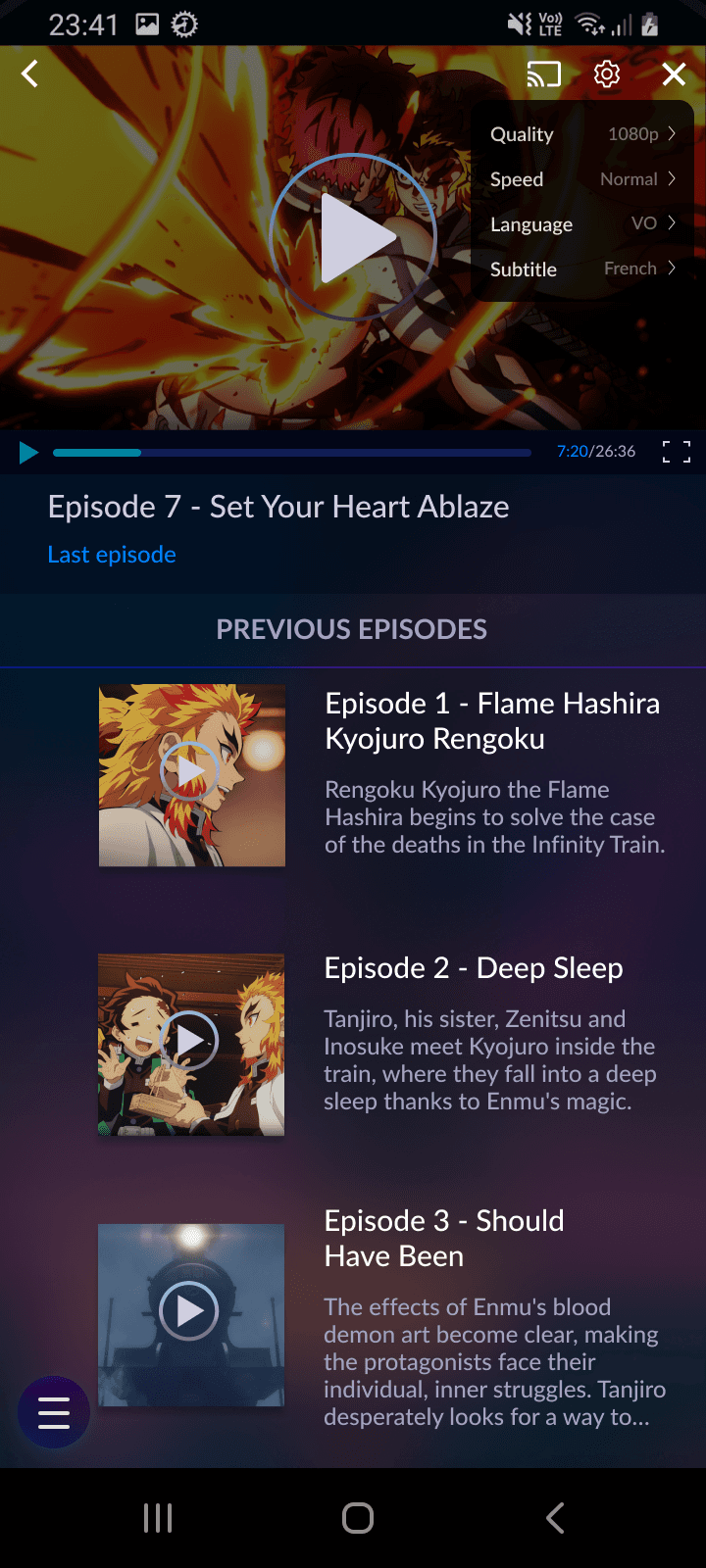
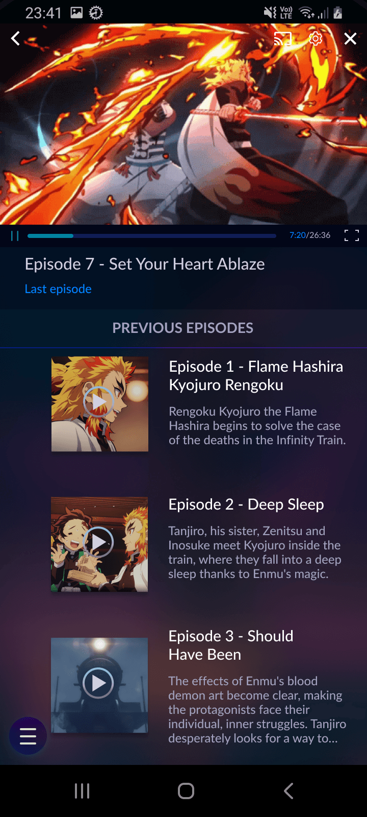
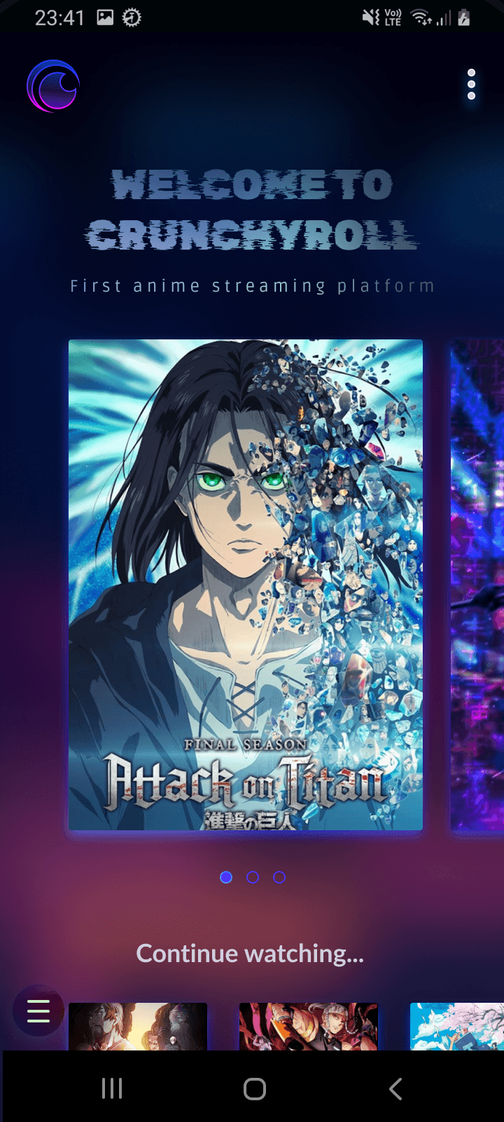
SNEAK PEEK TRAILER
SNEAK PEEK TRAILER
SNEAK PEEK TRAILER
SNEAK PEEK TRAILER
READ UI CASE STUDY
READ UI CASE STUDY
READ UI CASE STUDY
READ UI CASE STUDY
READ UI CASE STUDY
READ UI CASE STUDY
READ UI CASE STUDY
The ui challenge
IRONHACK (UX/UI Design bootcamp) challenged us to clone and redesign an app of our choosing within 3 days (February 2023), without having to worry about the research and UX part. It was quite exciting as it was my first individual project.
I opted to work on CRUNCHYROLL, the leading online anime streaming platform, which also has a mobile app. As a CRUNCHYROLL user myself, I had already identified several UI and UX issues within their app. This project was the perfect chance for me to address these concerns and make improvements.
problems to be solved
I conducted a Heuristic Analysis of the Crunchyroll app to assess its usability.
I found three main problems related to the "aesthetic and minimalist heuristic", which involves creating visually pleasing interfaces that aid user focus and simplify tasks:
The homepage is excessively long with endless scrolling, which can overwhelm users.
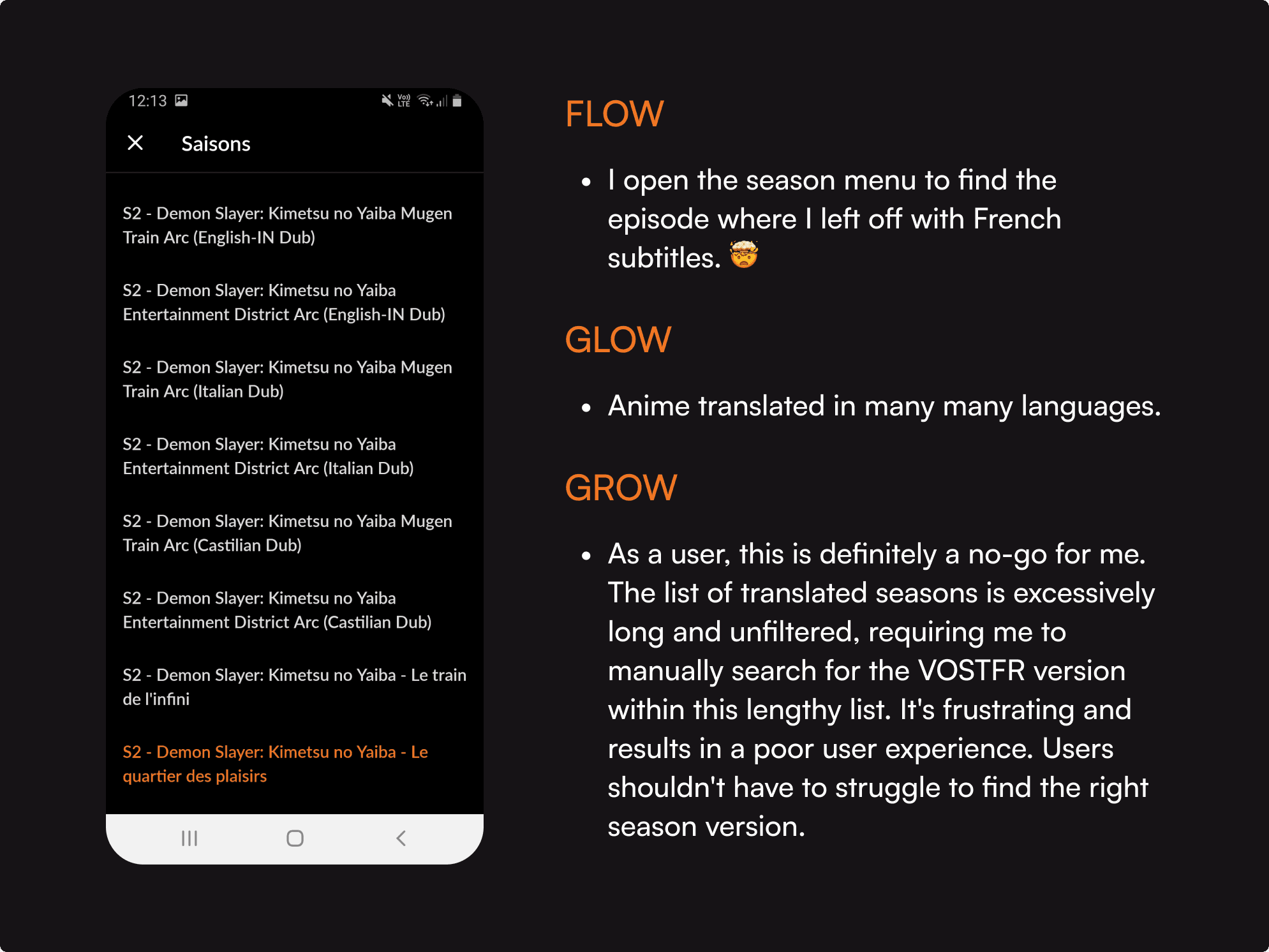
Navigating between seasons and episodes poses challenges, as users must sift through a lengthy list of seasons in different languages to find the desired one in their preferred language.
Outdated user interface that requires to be refreshed.
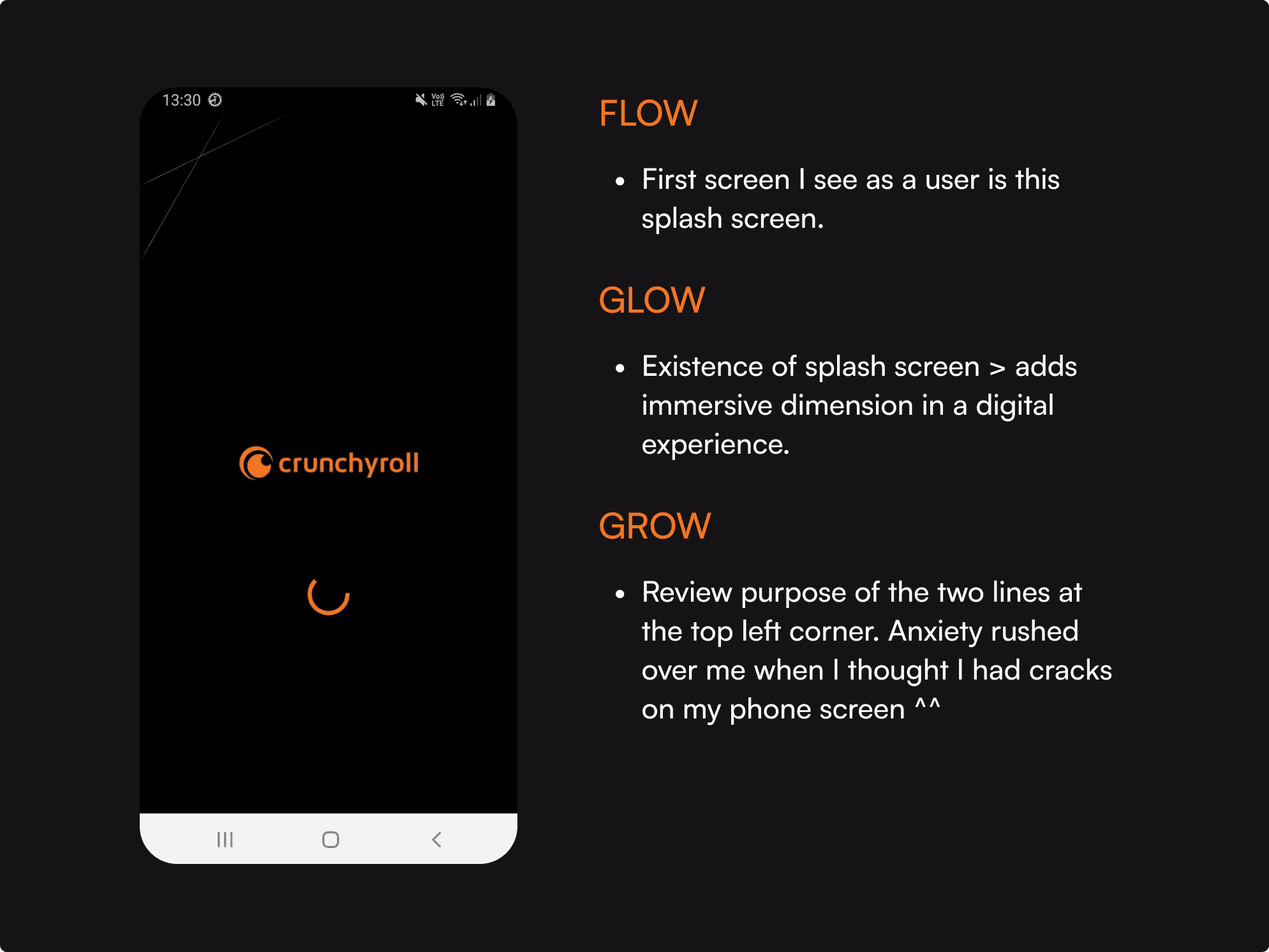
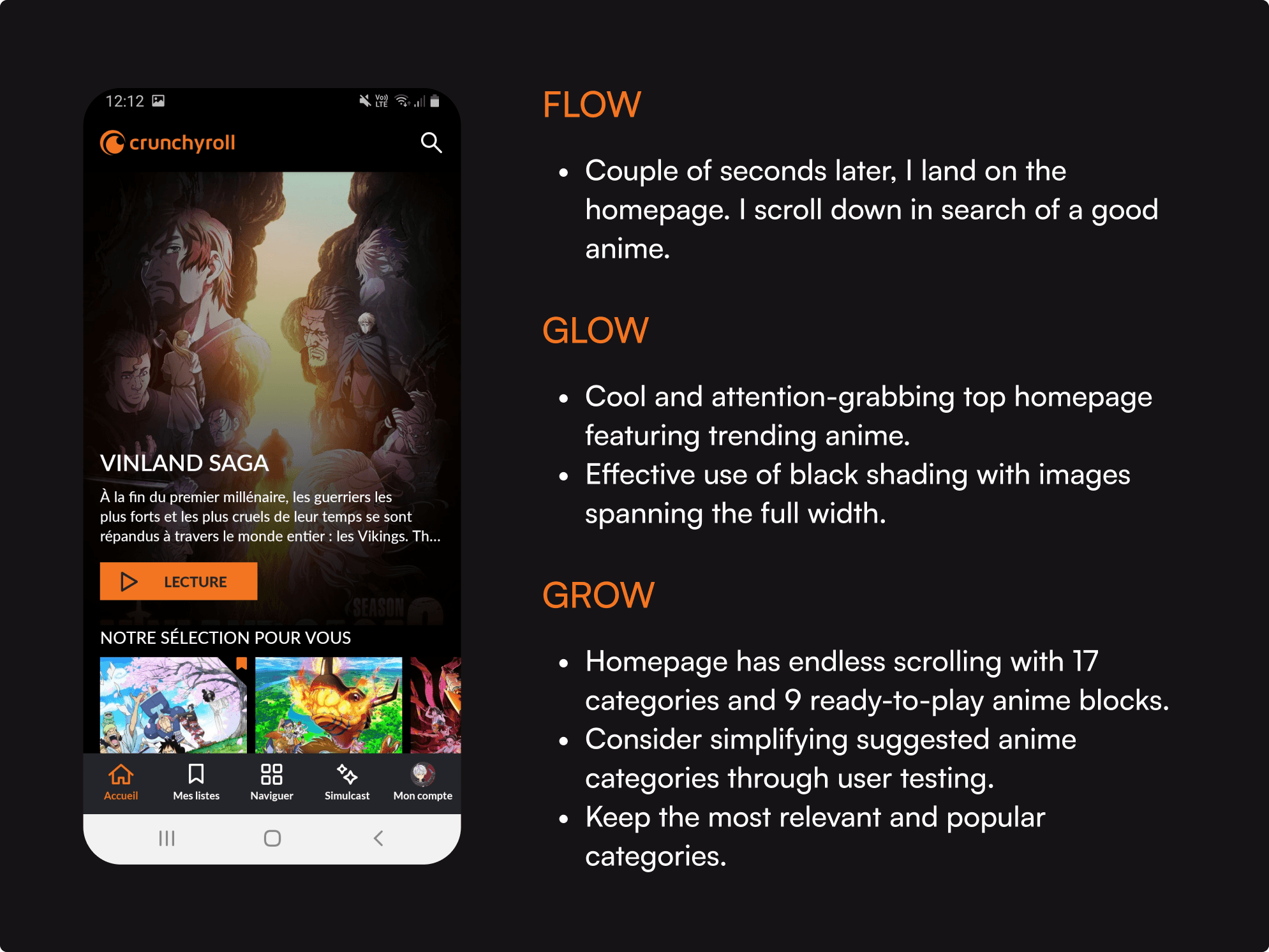
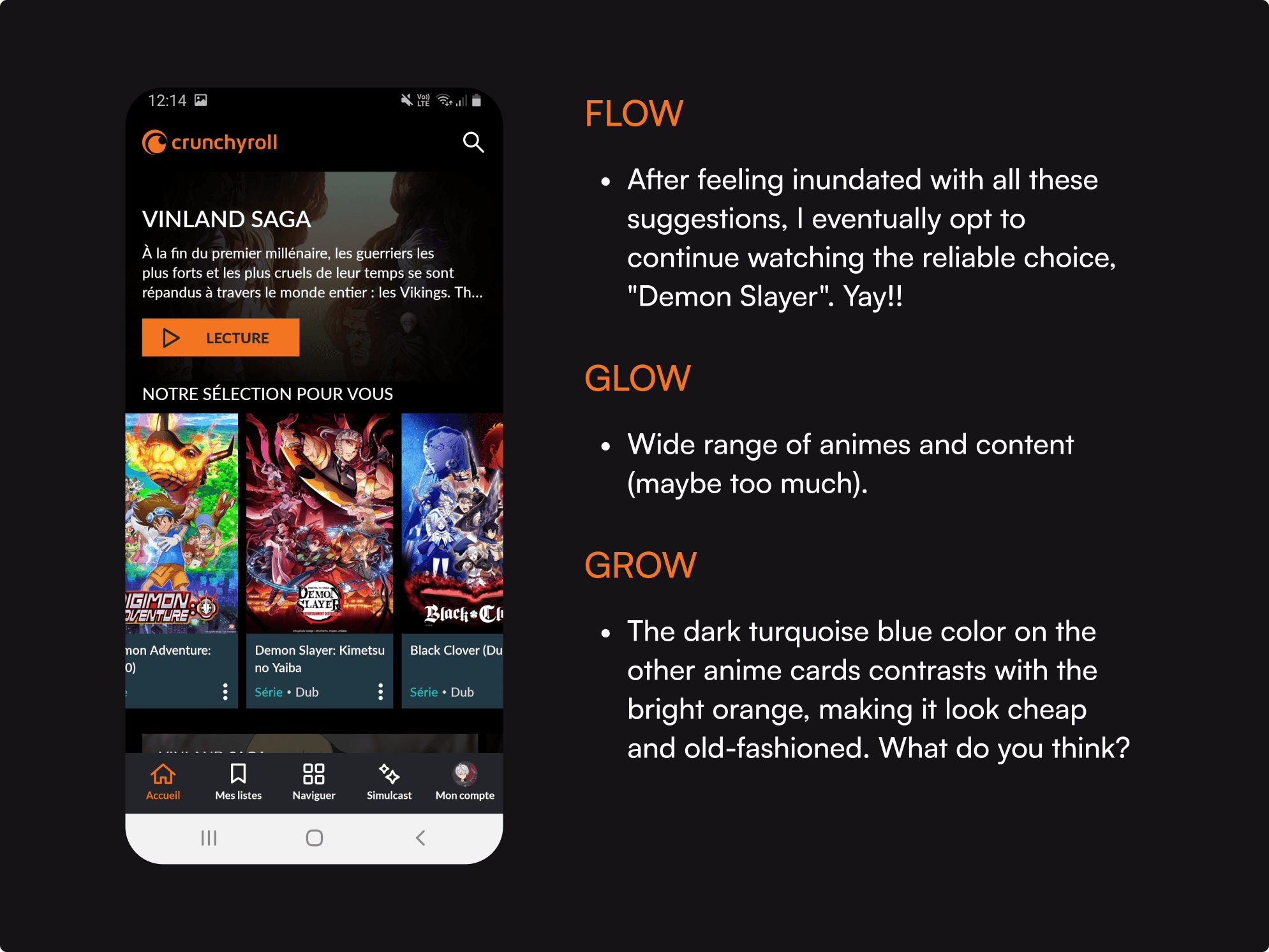
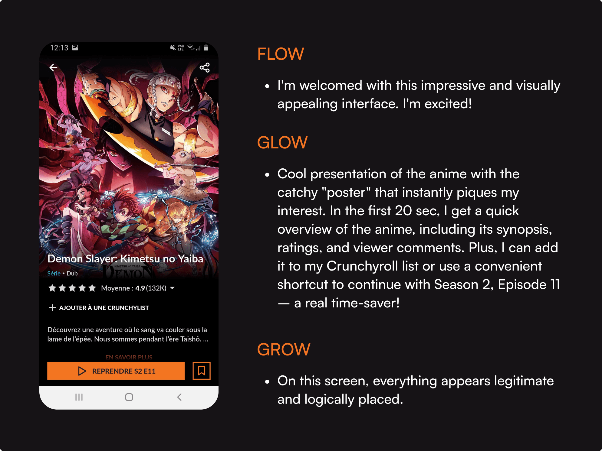
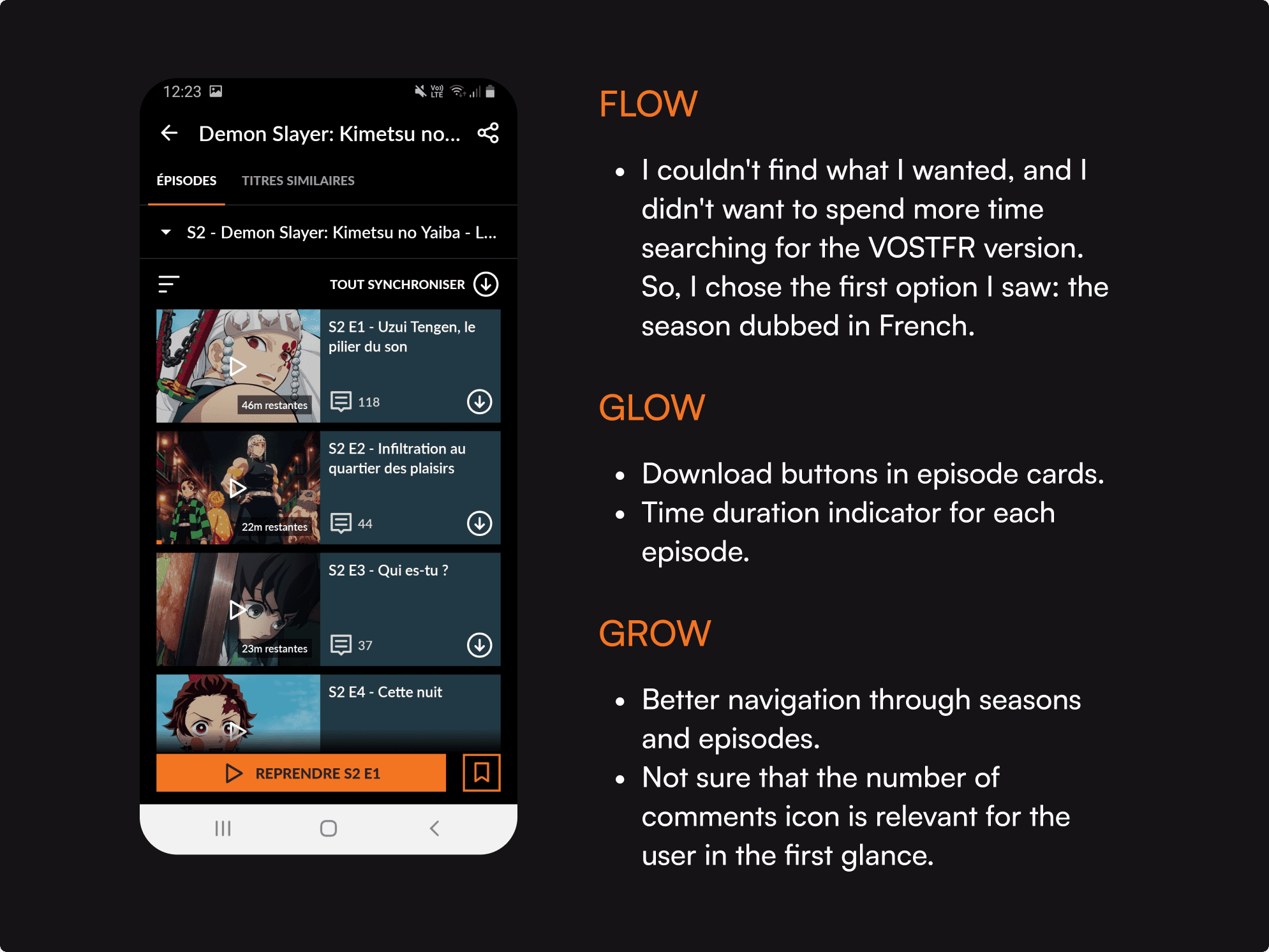
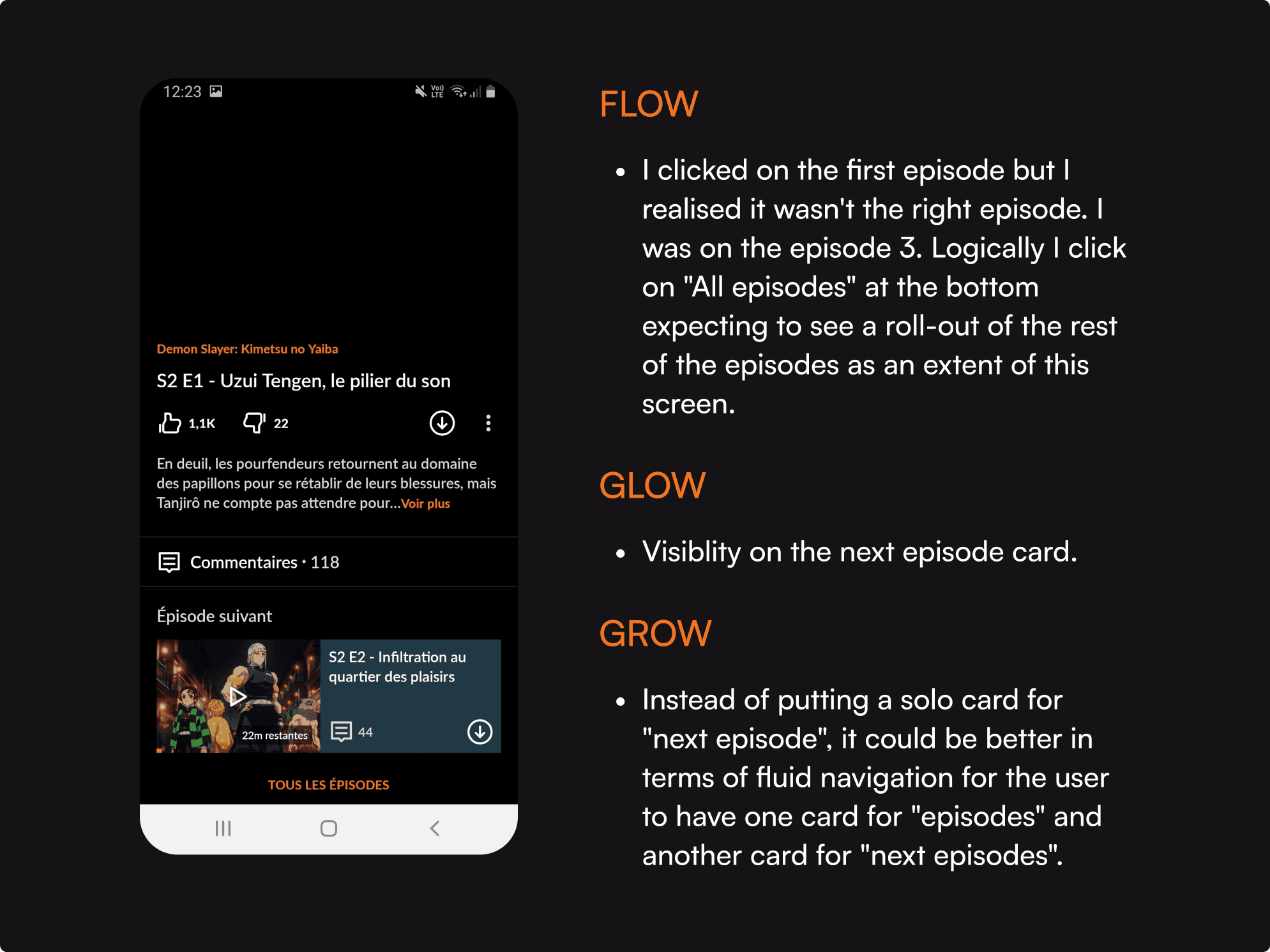
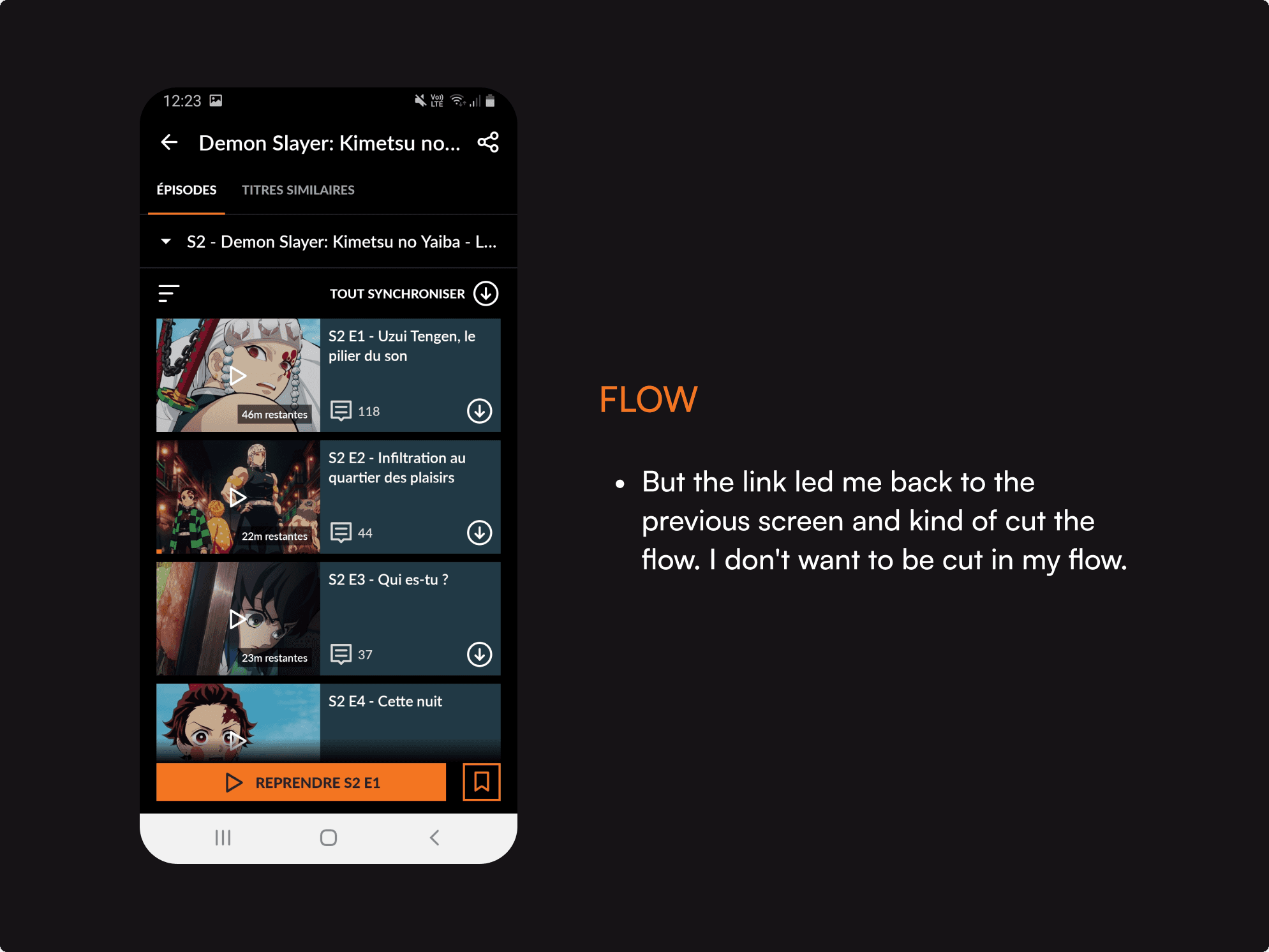
The task: Search for a suitable anime to watch and pick an episode in VOSTFR
The task: Search for a suitable anime to watch and pick an episode in VOSTFR
The task: Search for a suitable anime to watch and pick an episode in VOSTFR
The task: Search for a suitable anime to watch and pick an episode in VOSTFR
The task: Search for a suitable anime to watch and pick an episode in VOSTFR
Below, I'll outline the steps I took to accomplish the task, highlighting both the aspects I found effective and areas that could benefit from improvement.


my solution for a better
user-experience
The enhanced CRUNCHYROLL app aims to:
Visually engage its primary audience – tech-savvy individuals with a passion for modernity, games, Japan, and anime.
Prioritize sleek and fluid usability, with a homepage featuring only essential and minimalist recommendations.
Empower users to select subtitles or dubbing directly in the video settings.
Users can opt for dubbed episodes in their preferred language or enjoy the original version with their chosen subtitles.
I'd like to emphasize that this was a brief UI challenge. I didn't do any user research, interviews, nor user testings. My proposed solution is solely based on my assumptions and quick heuristic evaluations of the app. I recognize that a full rebrand or redesign would require more time and extensive user research. In this individual project, I did my best to experience and learn within the constraints of time and resources available.
Task: find easily the right season and
the right episode in prefered language and subtitle
Task: find easily the right season and
the right episode in prefered language and subtitle
Task: find easily the right season and
the right episode in prefered language and subtitle
Task: find easily the right season and
the right episode in prefered language and subtitle
Task: find easily the right season and
the right episode in prefered language and subtitle
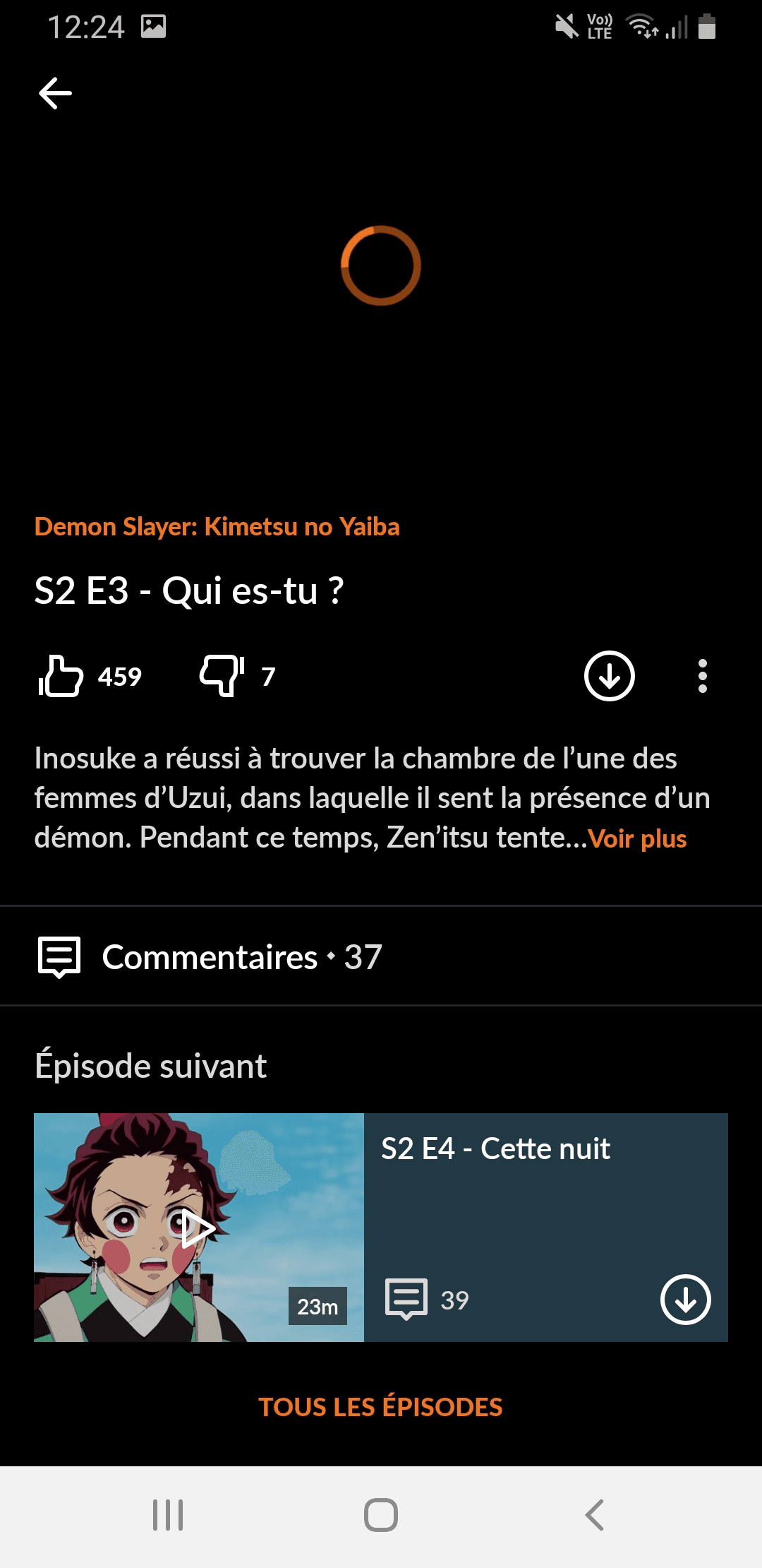
Before
Before
Before
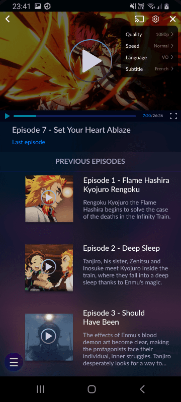
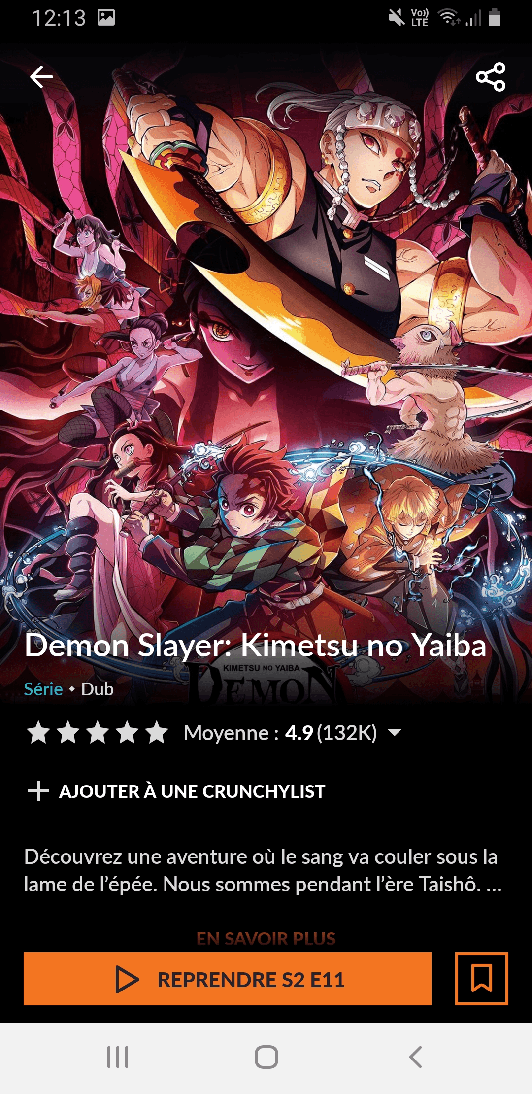
In this interface, you can't see the number of seasons; you have to click the dropdown arrow to find out.
When you click the dropdown menu for seasons, you're presented with a full list in various languages and dubs. There's no filtering option, so you have to manually search for your preferred version in this long list.
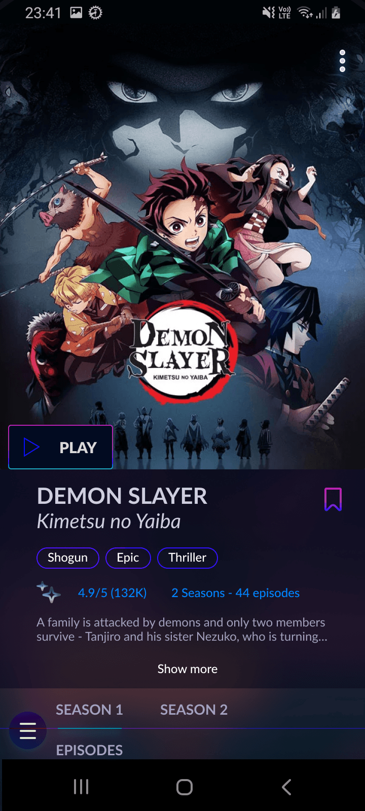
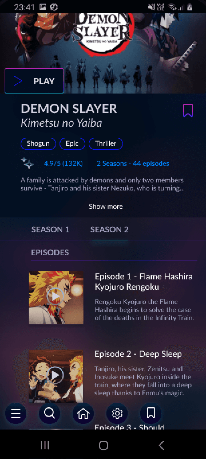
After
After
After
In this new version, you can see all the seasons directly. If there are many seasons, like in the case of One Piece, we can consider adding a dropdown arrow to view the additional seasons and arcs.
The default version of the anime is in Japanese (Original Version). To change this, click the 'Settings' icon and select your preferred language. You can also choose whether to add subtitles in your preferred language.
Ideally, the settings should stay the same, and the following episodes will be shown in your chosen language with subtitles, if there are any.
How did I come up with this solution ?
visual competitive analysis
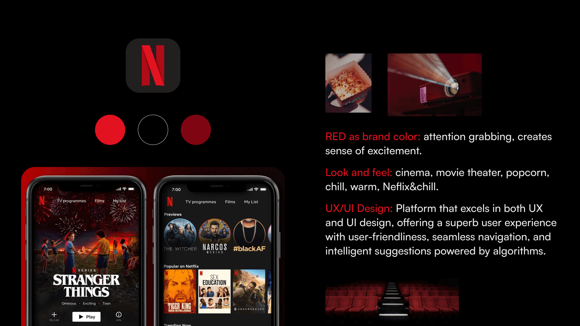
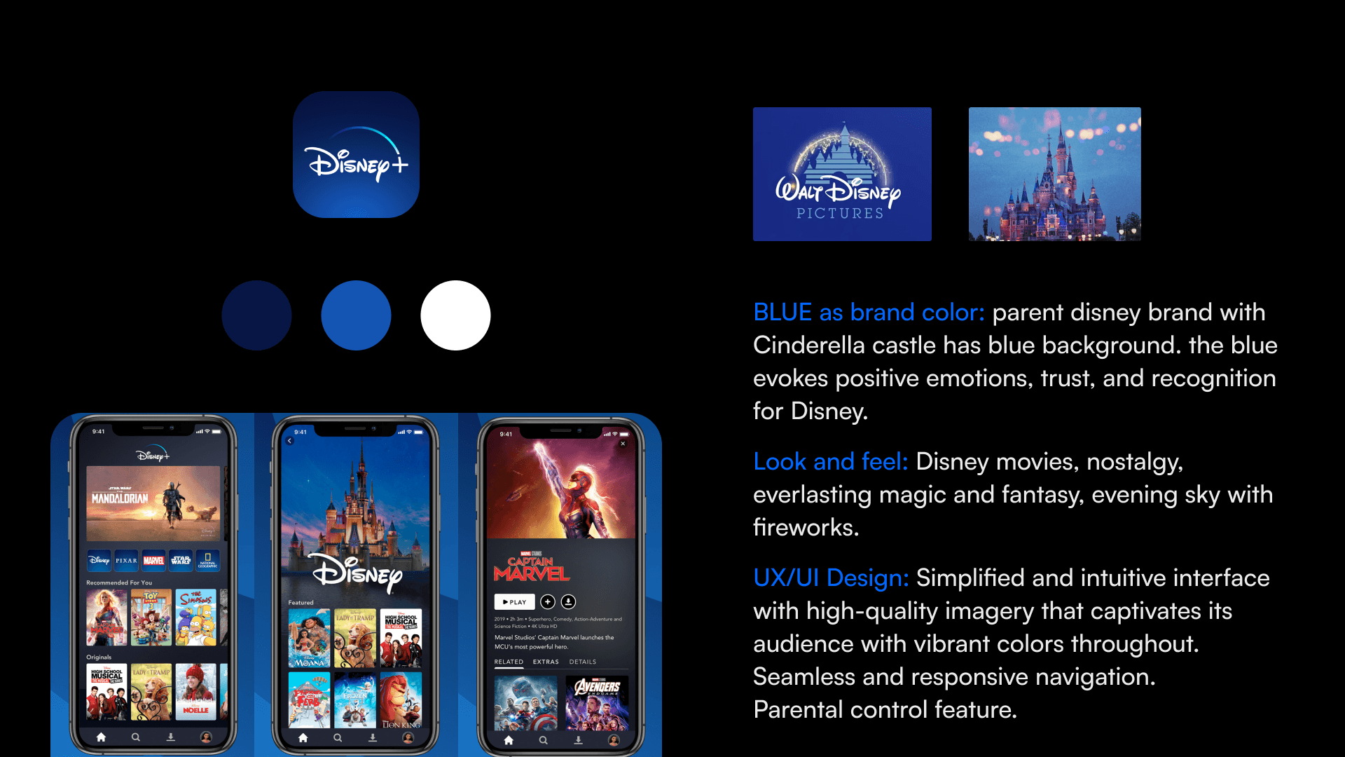
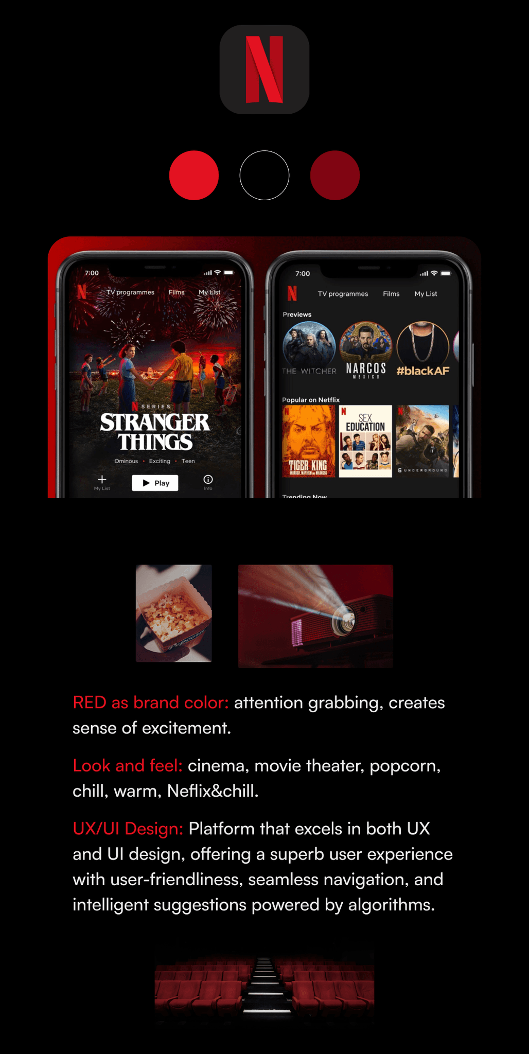
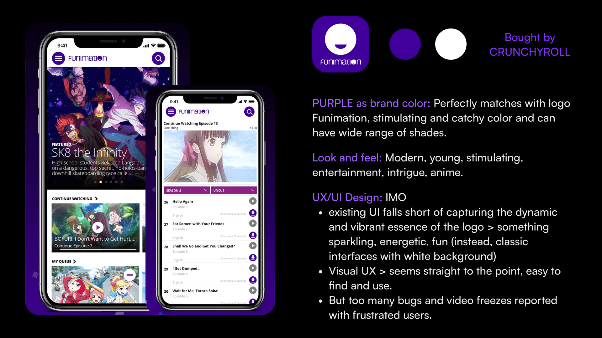
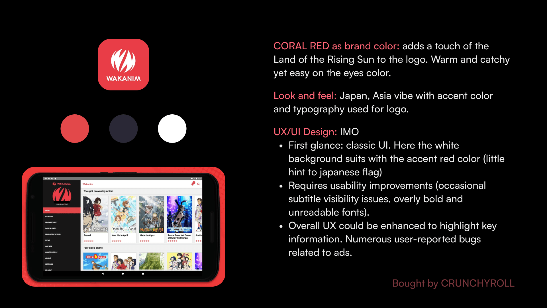
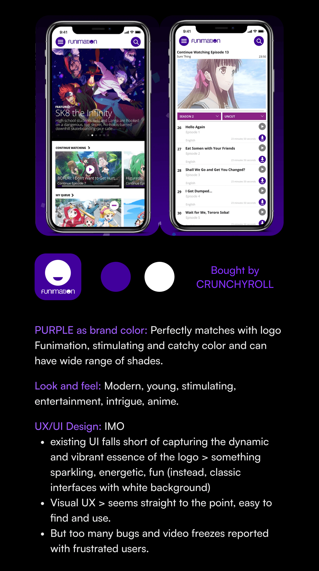
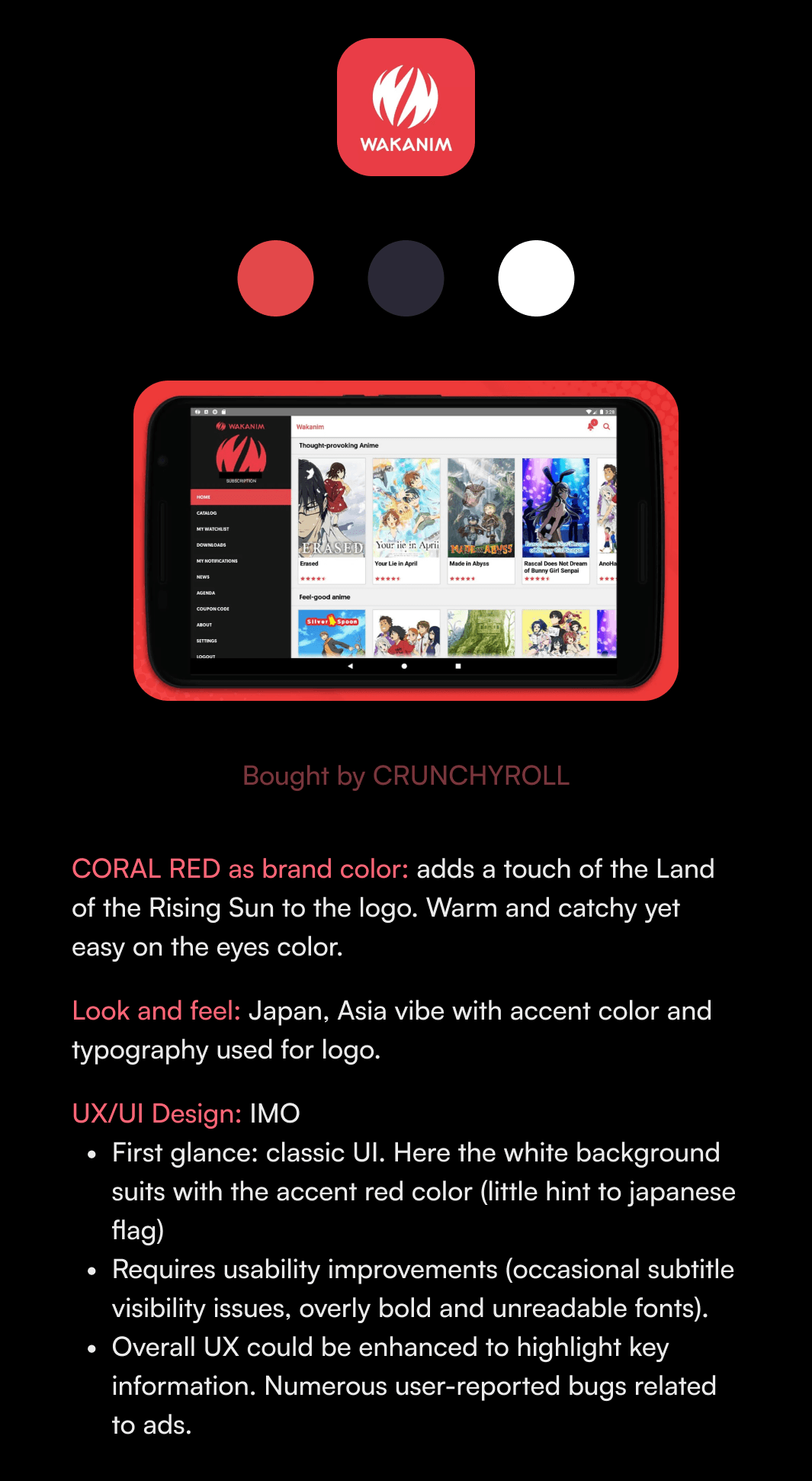
Right after assessing the app without being influenced by any other similar apps, I dived right into the visual competitive analysis in search of references. I wanted to see how the best streaming apps look like and work. Same with direct competitors at the time Wakanim and Funimation (before Crunchyroll's acquisition of both). Below you can see my findings.
For context, Crunchyroll's goal is to be the first anime streaming platform before Netflix.
how one of the two best streaming platforms look like

how CRUNCHYROLL's former direct competitors look like
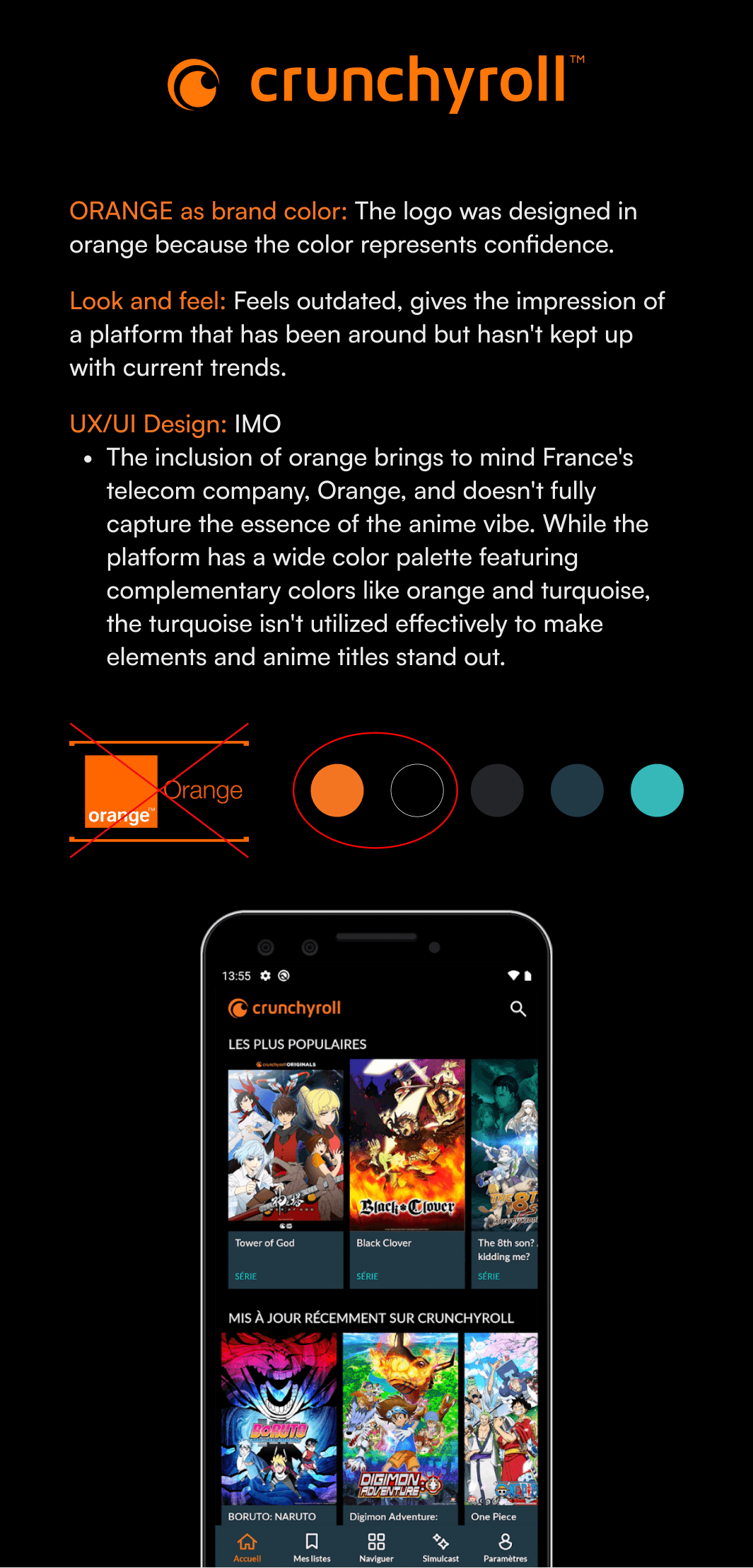
CRUNCHYROLL Look and feel
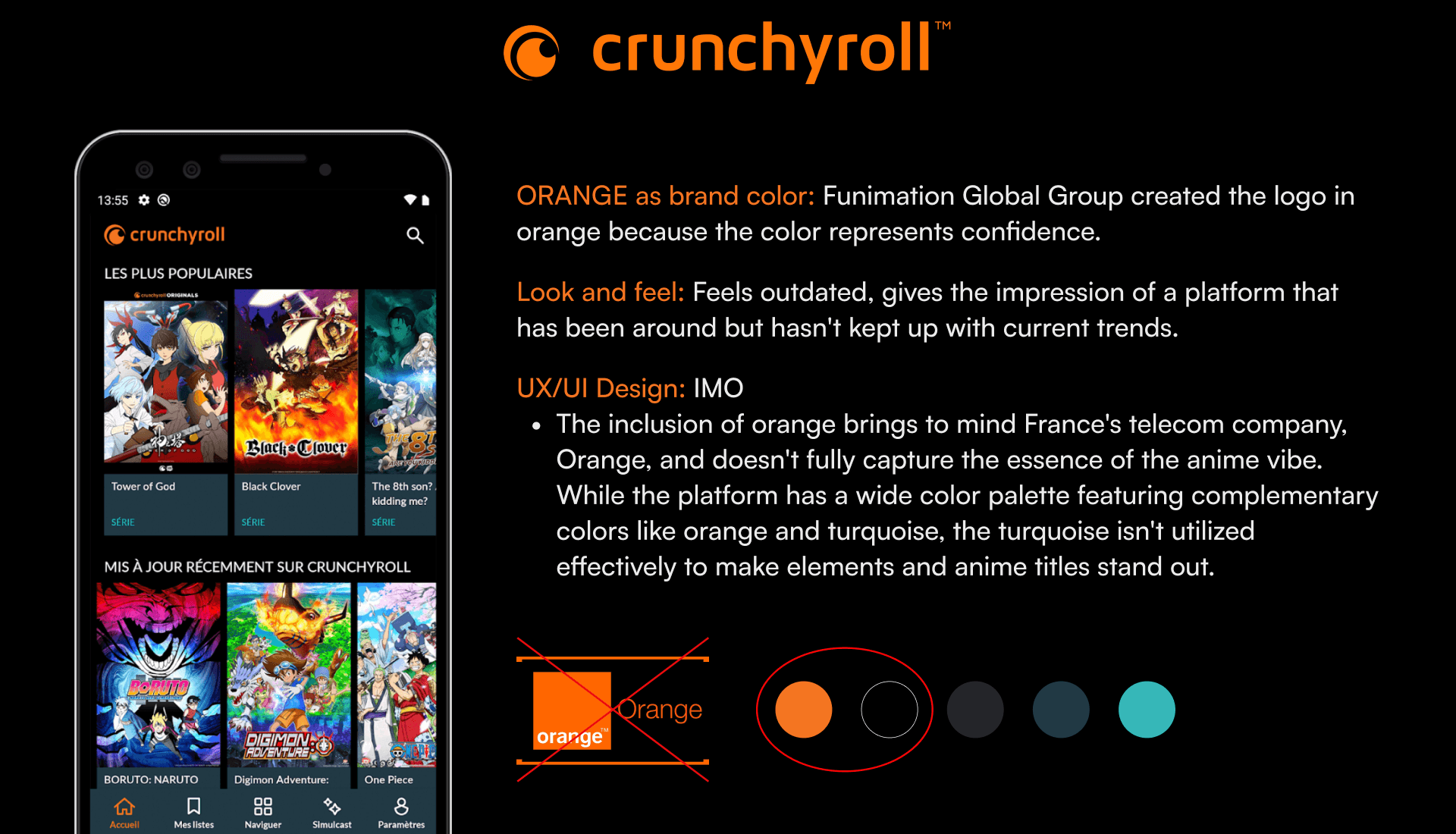
Conducting this visual competitive analysis helps me to visualize where CRUNCHRYOLL stands compared to others in terms of UI and briefly, UX.
ideation and sketches
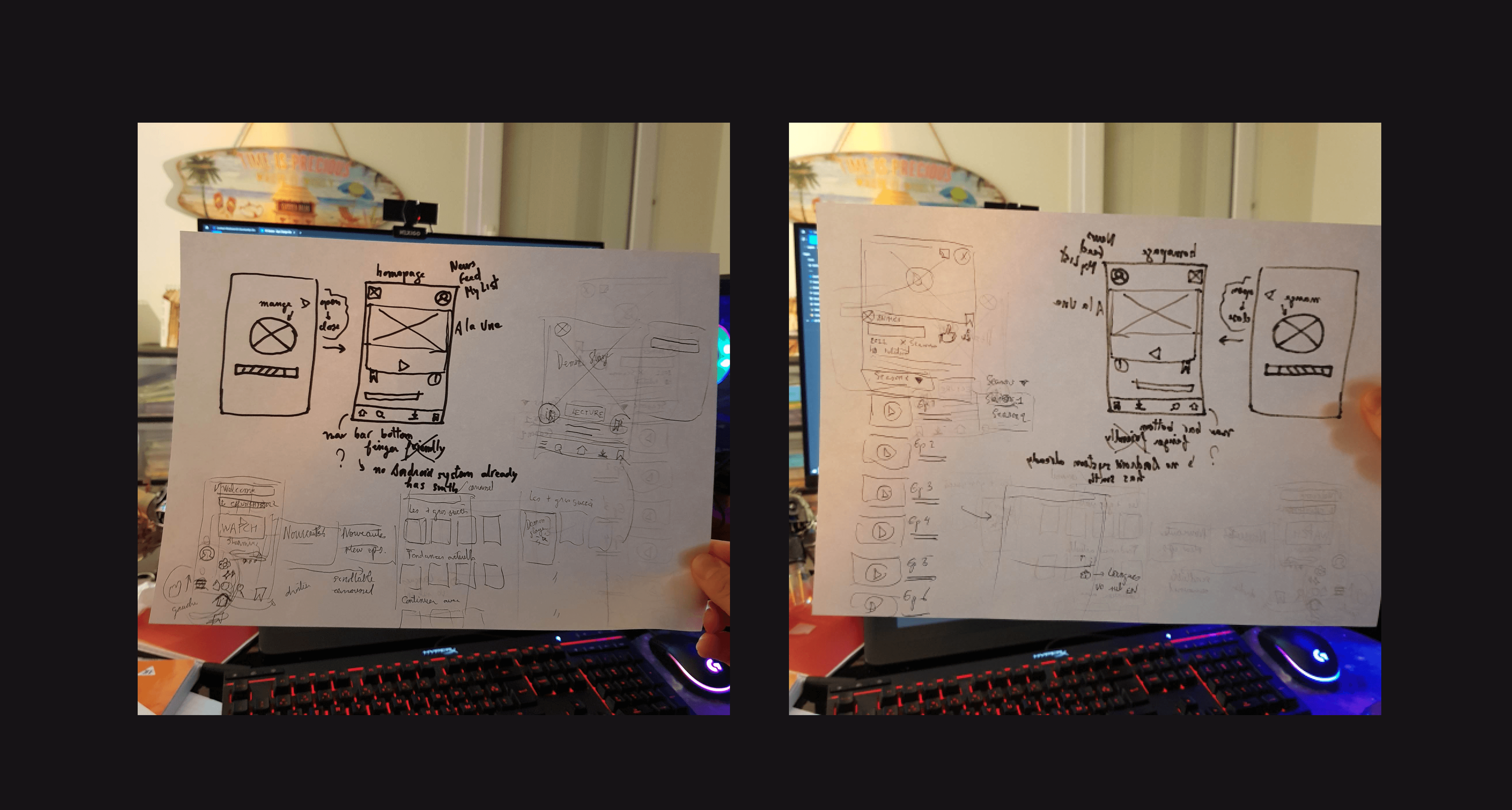
As I didn't spend too much time on cloning the existing app (I only cloned 3 screens out of 10), I saved more time for the ideation and lo-fi sketching phase. While it may not be apparent from these images, I experimented with several concept sketches to create a smoother and shorter user flow compared to the current one, asking myself:
How can I make the task of finding anime content and watching it in the preferred language easy and fluid?
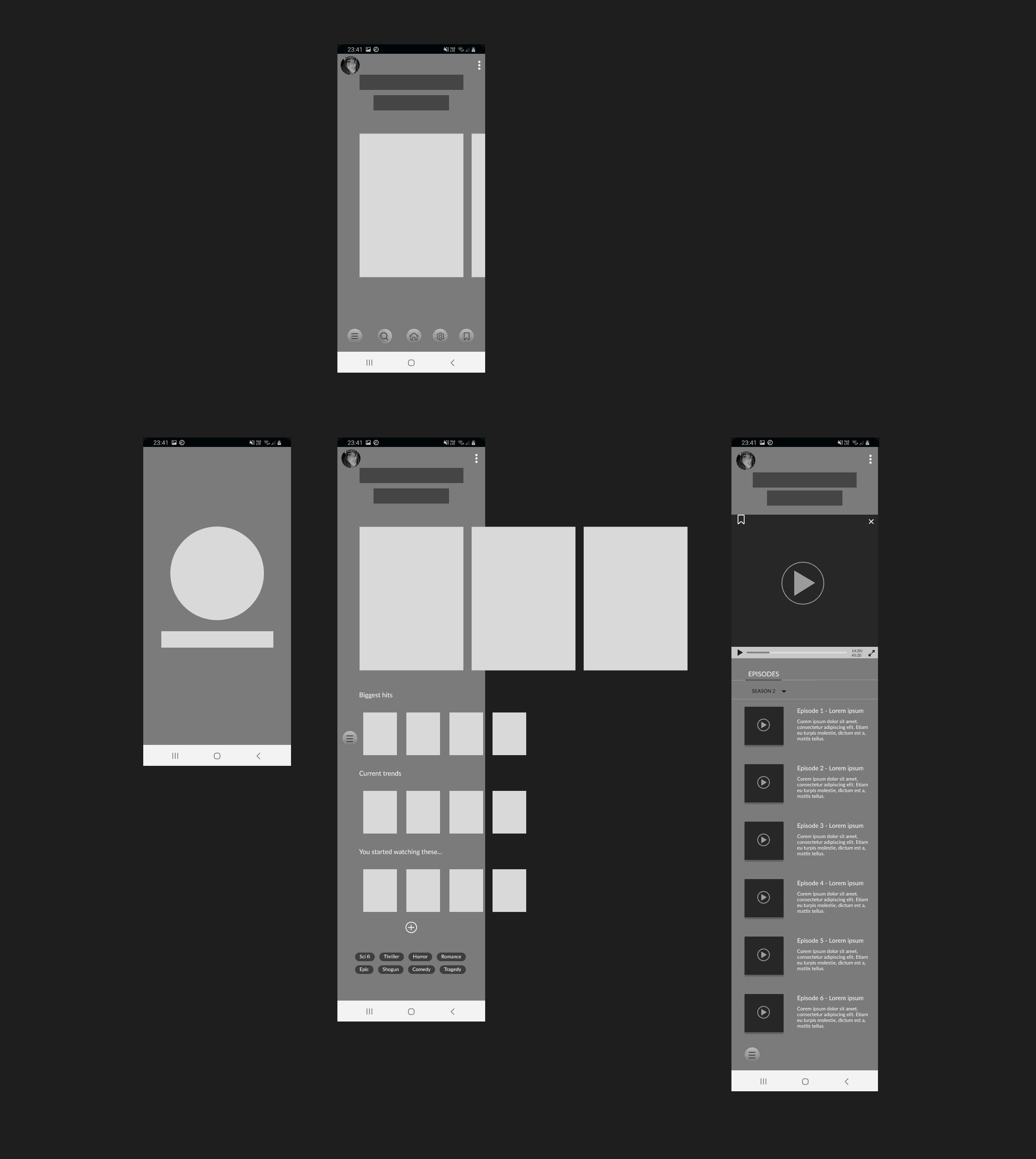
I narrowed the concept sketches down into mid-fi wireframe. Prototyped it and tested it on myself to see how it goes. This was the version I was most satisfied with. Also, I had to move on quick as clock was ticking.
visual design
color choice
Now that I had a clear idea of what the general skeleton of the new version would look like, I moved on to one of my favorite parts: finding the perfect clothing for CRUNCHYROLL.
Out of curiosity, I searched on Unsplash for "tech" pictures, entering "tech" into the search bar. These images below are the ones I found among the top suggestions. What colors come to your mind when you think about technlogy ?
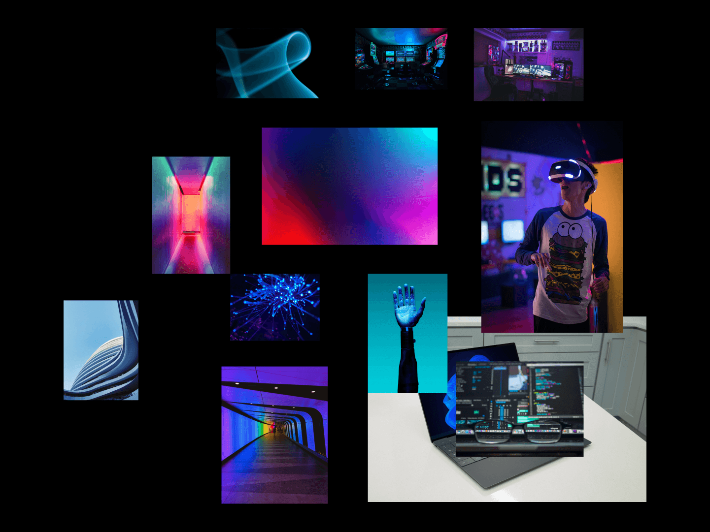
Red : movie theater, series, movies, traditional
Blue : tech, calm, pleases to a large public
Mix between red&blue : magenta
Magenta : young, modern, cyber, vibrant. When you search for “tech” pics you find pics with lot of blue, cyan and magenta
But, wait a second…Why did I search for tech pictures in the first place? What does it have to do with CRUNCHYROLL, an ANIME streaming app ?
Well I knew you would ask. Hold on, you're going to find the answer in the next section where I explain how I created my moodboard, right below :)
MOODBOARD: look and feel of crunchyroll
Why did I create this moodboard with these images ?
(Quick disclaimer: I don't own these images; they were found on Pinterest. Please contact me to remove specific pictures or for proper credit.)
I began by asking myself (an anime lover) and two of my friends who watch anime, as well as one person who doesn't watch anime but uses streaming platforms:
"What images come to mind when you think of an anime and manga streaming platform?"
I received several responses, including my own ^^:
Something modern
Anime, manga
Otaku
Japan
Techy
Pixel
Streaming
Futuristic
Energetic
Engaging
Teen
Young
Unreal
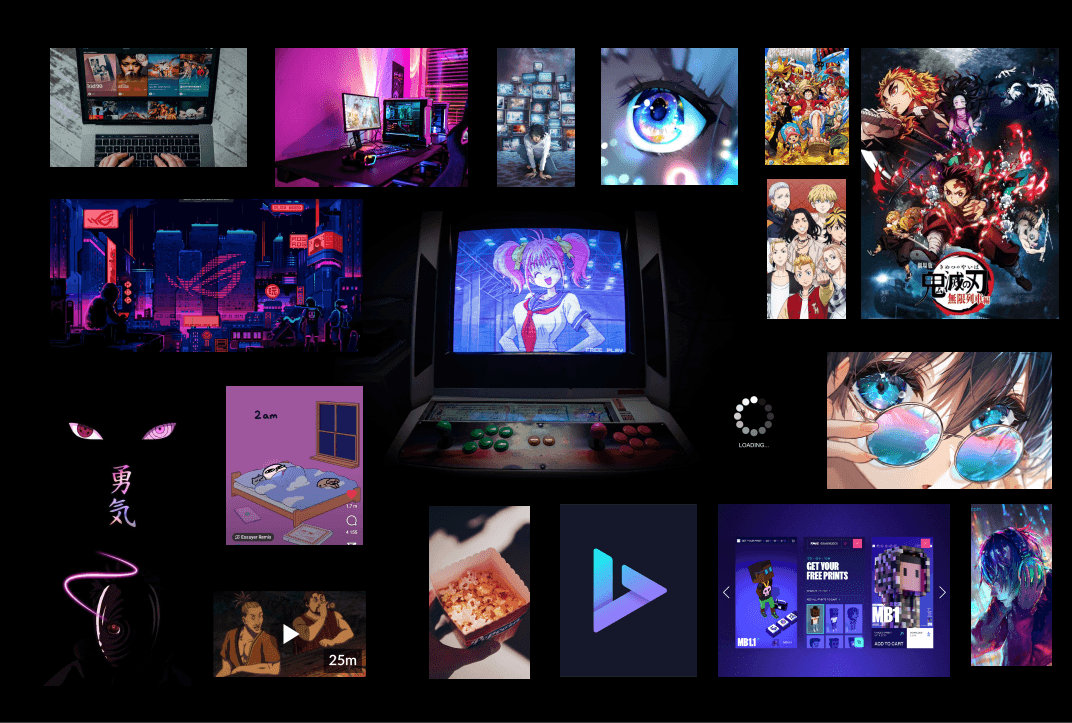
Based on these ideas and words, I then crafted a moodboard with corresponding images to capture the essence of the concept.
Next, I conducted the moodboard test with my colleagues from the design cohort. I presented my moodboard to them and gathered their impressions of the brand attributes it evoked. From their responses, I selected the main and recurring attributes, which included:
Streaming
Tech-savvy
Engaging
Anime
Vibrant
Mission accomplished! I would base the new visual design of Crunchyroll on these brand attributes that emerged from collective insight.
So "Tech" was a prominent image people had in their mind for an anime streaming app. Is this association because of the word "anime", which leads them to think of Japan and its reputation for advanced technology, including AI robots, or is it also influenced by the term "streaming", which may make them think of "streamer" culture? I have no idea. Maybe we could have our answer with more research but for now, let's be content with our color choice, magenta for our new app.
Why did I create this moodboard with these images ?
(Quick disclaimer: I don't own these images; they were found on Pinterest. Please contact me to remove specific pictures or for proper credit.)
I began by asking myself (an anime lover) and two of my friends who watch anime, as well as one person who doesn't watch anime but uses streaming platforms:
"What images come to mind when you think of an anime and manga streaming platform?"
I received several responses, including my own ^^:
Something modern
Anime, manga
Otaku
Japan
Techy
Pixel
Streaming
Futuristic
Energetic
Engaging
Teen
Young
Unreal
Based on these ideas and words, I then crafted a moodboard with corresponding images to capture the essence of the concept.
Next, I conducted the moodboard test with my colleagues from the design cohort. I presented my moodboard to them and gathered their impressions of the brand attributes it evoked. From their responses, I selected the main and recurring attributes, which included:
Streaming
Tech-savvy
Engaging
Anime
Vibrant
Mission accomplished! I would base the new visual design of Crunchyroll on these brand attributes that emerged from collective insight.
So "Tech" was a prominent image people had in their mind for an anime streaming app. Is this association because of the word "anime", which leads them to think of Japan and its reputation for advanced technology, including AI robots, or is it also influenced by the term "streaming", which may make them think of "streamer" culture? I have no idea. Maybe we could have our answer with more research but for now, let's be content with our color choice, magenta for our new app.
new style tile
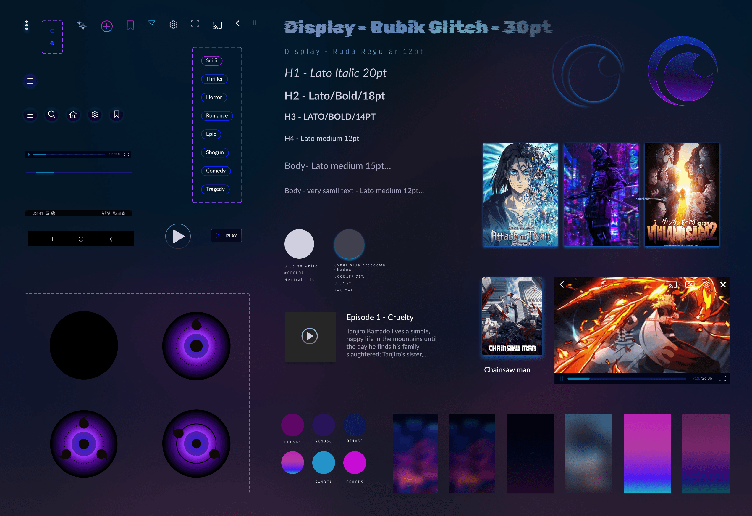
This style tile is the final result of many many explorations and tests with different background colors etc. I stayed in the purple-magenta-blue color tone.
I searched for something not boring, interesting, dynamic and appealing.
Final Designs
HI-FI wireflow
After many late-night iterations and with support from my project teacher at IRONHACK, I finally achieved something I was truly satisfied with, considering the timeframe.
Before
Before
Before

After
After
After

zoom on settings


Watch prototype in action ✨
your turn to play with the prototype ✨
Open FIGMA to interact with the hi-fi prototype :)
New Version
Before
New Version
Before
New Version
Before
New Version
Before
Next Steps and Main Takeways
Next steps:
If this was a real project, I would have loved to take care of the whole UX aspect, interviewing and testing with users and do some Guerilla research as there are already so many frustrated people's comments out there are and satisfied users' comments too. Also work thoroughly on the Visual Design, spending more time on the branding and do some A/B testings with users.
In retrospect, the color choice for the logo, which I thought was cool back then at 1 am, was quite questionable with a refreshed and rested perspective few weeks later...as well as many other things.
Main takeways:
This was the most challenging yet the funniest project ever. Even if it was only three days, I pushed myself really hard to come up with the best version I could produce to learn a maximum. I learned a looot and especially thanks to my amazing teacher Vince Rubio.
Thank you so much for reading 💜
Feel free to say hi on LinkedIn, would love to hear your feedback or anything.
The ui challenge
IRONHACK (UX/UI Design bootcamp) challenged us to clone and redesign an app of our choosing within 3 days (February 2023), without having to worry about the research and UX part. It was quite exciting as it was my first individual project.
I opted to work on CRUNCHYROLL, the leading online anime streaming platform, which also has a mobile app. As a CRUNCHYROLL user myself, I had already identified several UI and UX issues within their app. This project was the perfect chance for me to address these concerns and make improvements.
problems
to be solved
I conducted a Heuristic Analysis of the Crunchyroll app to assess its usability.
I found three main problems related to the "aesthetic and minimalist heuristic", which involves creating visually pleasing interfaces that aid user focus and simplify tasks:
The homepage is excessively long with endless scrolling, which can overwhelm users.
Navigating between seasons and episodes poses challenges, as users must sift through a lengthy list of seasons in different languages to find the desired one in their preferred language.
Outdated user interface that requires to be refreshed.
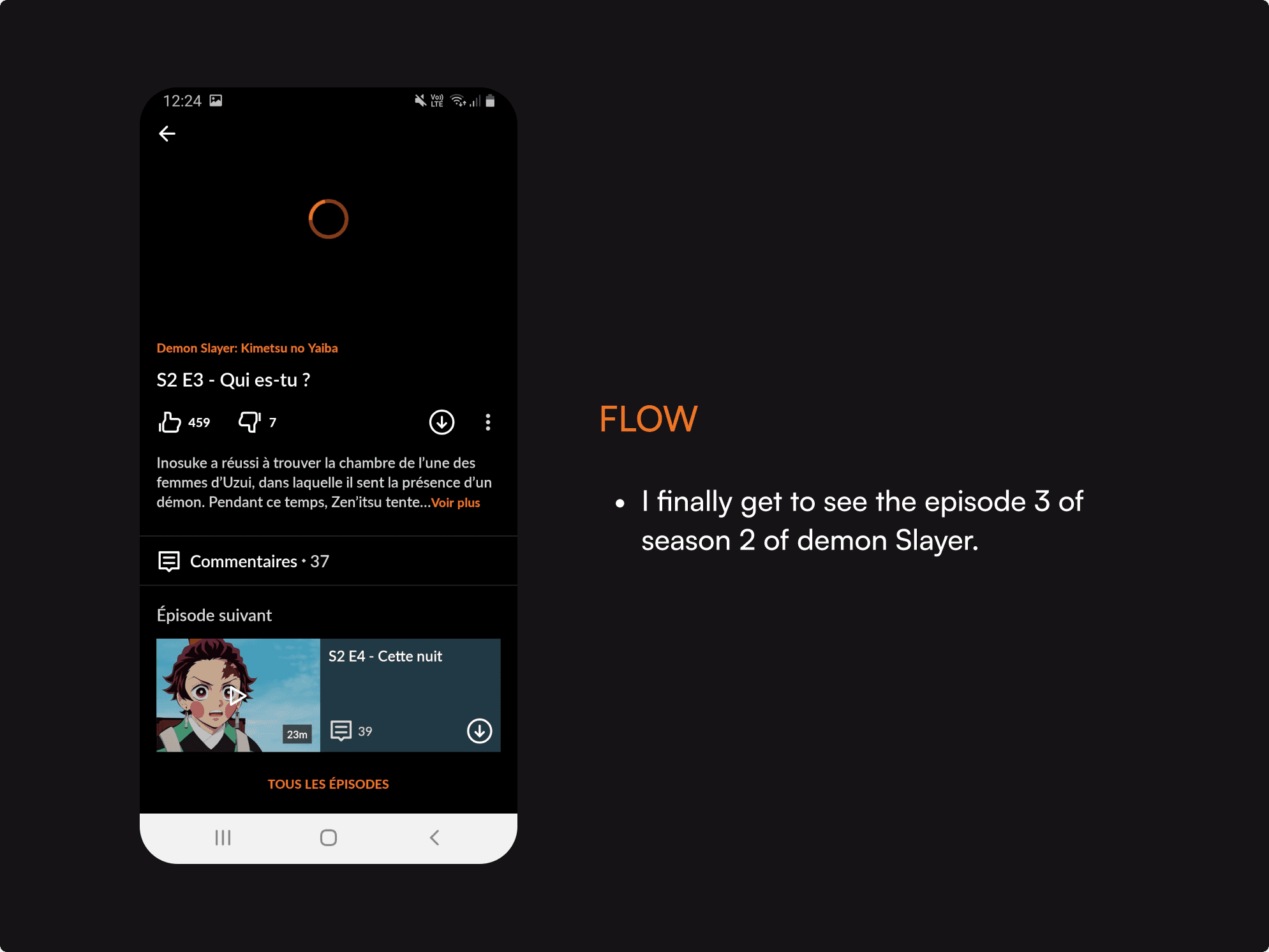
The task: Search for a suitable anime to watch and pick an episode in VOSTFR
Below, I'll outline the steps I took to accomplish the task, highlighting both the aspects I found effective and areas that could benefit from improvement.
my solution
for a better
user-experience
The enhanced CRUNCHYROLL app aims to:
Visually engage its primary audience – tech-savvy individuals with a passion for modernity, games, Japan, and anime.
Prioritize sleek and fluid usability, with a homepage featuring only essential and minimalist recommendations.
Empower users to select subtitles or dubbing directly in the video settings.
Users can opt for dubbed episodes in their preferred language or enjoy the original version with their chosen subtitles.
I'd like to emphasize that this was a brief UI challenge. I didn't do any user research, interviews, nor user testings. My proposed solution is solely based on my assumptions and quick heuristic evaluations of the app. I recognize that a full rebrand or redesign would require more time and extensive user research. In this individual project, I did my best to experience and learn within the constraints of time and resources available.
Task:
find easily the right season and
the right episode in prefered language and subtitle
Before
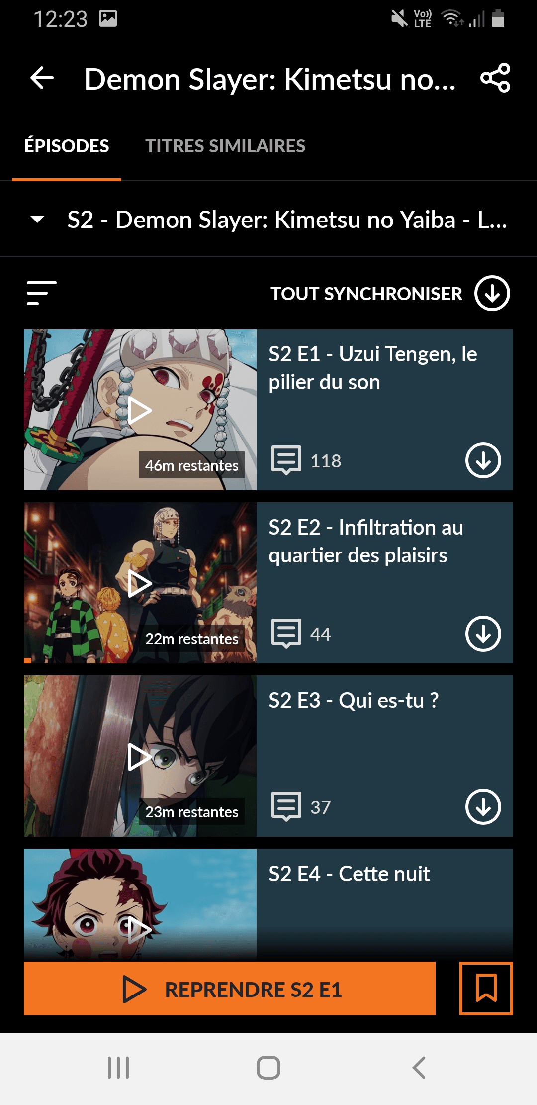
In this interface, you can't see the number of seasons; you have to click the dropdown arrow to find out.
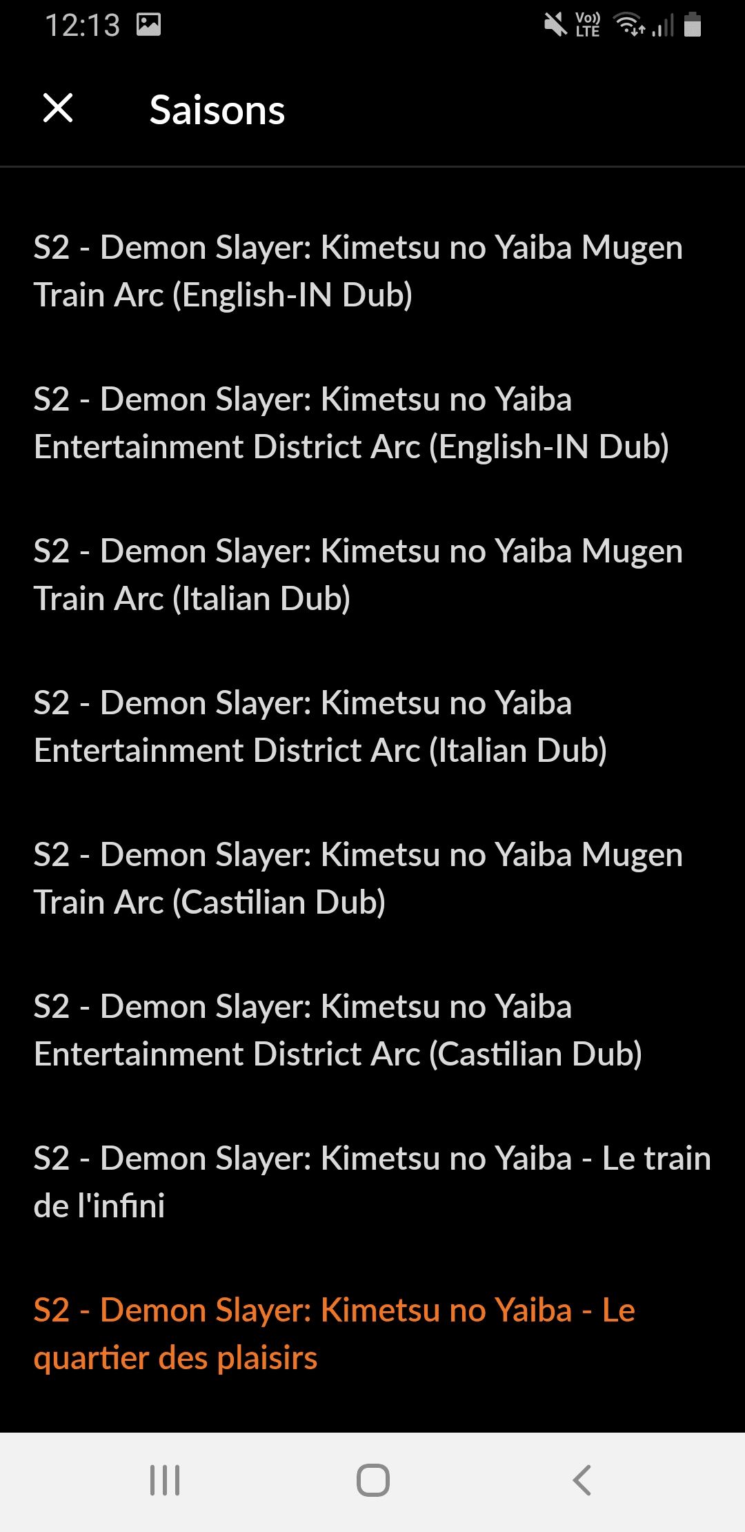
When you click the dropdown menu for seasons, you're presented with a full list in various languages and dubs. There's no filtering option, so you have to manually search for your preferred version in this long list.
After
In this new version, you can see all the seasons directly. If there are many seasons, like in the case of One Piece, we can consider adding a dropdown arrow to view the additional seasons and arcs.
The default version of the anime is in Japanese (Original Version). To change this, click the 'Settings' icon and select your preferred language. You can also choose whether to add subtitles in your preferred language.
Ideally, the settings should stay the same, and the following episodes will be shown in your chosen language with subtitles, if there are any.
How did I come up with this solution ?
visual competitive analysis
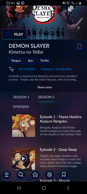
Right after assessing the app without being influenced by any other similar apps, I dived right into the visual competitive analysis in search of references. I wanted to see how the best streaming apps look like and work. Same with direct competitors at the time Wakanim and Funimation (before Crunchyroll's acquisition of both). Below you can see my findings.
For context, Crunchyroll's goal is to be the first anime streaming platform before Netflix.
how one of the two best streaming platforms look like
how CRUNCHYROLL's former direct competitors look like
CRUNCHYROLL Look and feel
Conducting this visual competitive analysis helps me to visualize where CRUNCHRYOLL stands compared to others in terms of UI and briefly, UX.
ideation and sketches
As I didn't spend too much time on cloning the existing app (I only cloned 3 screens out of 10), I saved more time for the ideation and lo-fi sketching phase. While it may not be apparent from these images, I experimented with several concept sketches to create a smoother and shorter user flow compared to the current one, asking myself:
How can I make the task of finding anime content and watching it in the preferred language easy and fluid?
I narrowed the concept sketches down into mid-fi wireframe. Prototyped it and tested it on myself to see how it goes. This was the version I was most satisfied with. Also, I had to move on quick as clock was ticking.
visual design
color choice
Now that I had a clear idea of what the general skeleton of the new version would look like, I moved on to one of my favorite parts: finding the perfect clothing for CRUNCHYROLL.
Out of curiosity, I searched on Unsplash for "tech" pictures, entering "tech" into the search bar. These images below are the ones I found among the top suggestions. What colors come to your mind when you think about technlogy ?
Red : movie theater, series, movies, traditional
Blue : tech, calm, pleases to a large public
Mix between red&blue : magenta
Magenta : young, modern, cyber, vibrant. When you search for “tech” pics you find pics with lot of blue, cyan and magenta
But, wait a second…Why did I search for tech pictures in the first place? What does it have to do with CRUNCHYROLL, an ANIME streaming app ?
Well I knew you would ask. Hold on, you're going to find the answer in the next section where I explain how I created my moodboard, right below :)
MOODBOARD: look and feel of crunchyroll
Why did I create this moodboard with these images ?
(Quick disclaimer: I don't own these images; they were found on Pinterest. Please contact me to remove specific pictures or for proper credit.)
I began by asking myself (an anime lover) and two of my friends who watch anime, as well as one person who doesn't watch anime but uses streaming platforms:
"What images come to mind
when you think of an anime and
manga streaming platform?"
I received several responses, including my own ^^:
Something modern
Anime, manga
Otaku
Japan
Techy
Pixel
Streaming
Futuristic
Energetic
Engaging
Teen
Young
Unreal
Based on these ideas and words, I then crafted a moodboard with corresponding images to capture the essence of the concept.
Next, I conducted the moodboard test with my colleagues from the design cohort. I presented my moodboard to them and gathered their impressions of the brand attributes it evoked. From their responses, I selected the main and recurring attributes, which included:
Streaming
Tech-savvy
Engaging
Anime
Vibrant
Mission accomplished! I would base the new visual design of Crunchyroll on these brand attributes that emerged from collective insight.
So "Tech" was a prominent image people had in their mind for an anime streaming app. Is this association because of the word "anime", which leads them to think of Japan and its reputation for advanced technology, including AI robots, or is it also influenced by the term "streaming", which may make them think of "streamer" culture? I have no idea. Maybe we could have our answer with more research but for now, let's be content with our color choice, magenta for our new app.
new style tile
This style tile is the final result of many many explorations and tests with different background colors etc. I stayed in the purple-magenta-blue color tone.
I searched for something not boring, interesting, dynamic and appealing.
Final Designs
HI-FI wireflow
After many late-night iterations and with support from my project teacher at IRONHACK, I finally achieved something I was truly satisfied with, considering the timeframe.
Before
After
zoom on settings
Watch prototype in action ✨
your turn to play with the prototype ✨
Open FIGMA to interact with the hi-fi prototype :)
New Version
Before
New Version
Before
New Version
Before
New Version
Before
Next Steps and Main Takeways
Next steps:
If this was a real project, I would have loved to take care of the whole UX aspect, interviewing and testing with users and do some Guerilla research as there are already so many frustrated people's comments out there are and satisfied users' comments too. Also work thoroughly on the Visual Design, spending more time on the branding and do some A/B testings with users.
In retrospect, the color choice for the logo, which I thought was cool back then at 1 am, was quite questionable with a refreshed and rested perspective few weeks later...as well as many other things.
Main takeways:
This was the most challenging yet the funniest project ever. Even if it was only three days, I pushed myself really hard to come up with the best version I could produce to learn a maximum. I learned a looot and especially thanks to my amazing teacher Vince Rubio.
Thank you so much for reading 💜
Feel free to say hi on LinkedIn, would love to hear your feedback or anything.
The ui challenge
IRONHACK (UX/UI Design bootcamp) challenged us to clone and redesign an app of our choosing within 3 days (February 2023), without having to worry about the research and UX part. It was quite exciting as it was my first individual project.
I opted to work on CRUNCHYROLL, the leading online anime streaming platform, which also has a mobile app. As a CRUNCHYROLL user myself, I had already identified several UI and UX issues within their app. This project was the perfect chance for me to address these concerns and make improvements.
problems
to be solved
I conducted a Heuristic Analysis of the Crunchyroll app to assess its usability.
I found three main problems related to the "aesthetic and minimalist heuristic", which involves creating visually pleasing interfaces that aid user focus and simplify tasks:
The homepage is excessively long with endless scrolling, which can overwhelm users.
Navigating between seasons and episodes poses challenges, as users must sift through a lengthy list of seasons in different languages to find the desired one in their preferred language.
Outdated user interface that requires to be refreshed.
The task: Search for a suitable anime to watch and pick an episode in VOSTFR
Below, I'll outline the steps I took to accomplish the task, highlighting both the aspects I found effective and areas that could benefit from improvement.
my solution
for a better
user-experience
The enhanced CRUNCHYROLL app aims to:
Visually engage its primary audience – tech-savvy individuals with a passion for modernity, games, Japan, and anime.
Prioritize sleek and fluid usability, with a homepage featuring only essential and minimalist recommendations.
Empower users to select subtitles or dubbing directly in the video settings.
Users can opt for dubbed episodes in their preferred language or enjoy the original version with their chosen subtitles.
I'd like to emphasize that this was a brief UI challenge. I didn't do any user research, interviews, nor user testings. My proposed solution is solely based on my assumptions and quick heuristic evaluations of the app. I recognize that a full rebrand or redesign would require more time and extensive user research. In this individual project, I did my best to experience and learn within the constraints of time and resources available.
Task:
find easily the right season and
the right episode in prefered language and subtitle
Before
In this interface, you can't see the number of seasons; you have to click the dropdown arrow to find out.
When you click the dropdown menu for seasons, you're presented with a full list in various languages and dubs. There's no filtering option, so you have to manually search for your preferred version in this long list.
After
In this new version, you can see all the seasons directly. If there are many seasons, like in the case of One Piece, we can consider adding a dropdown arrow to view the additional seasons and arcs.
The default version of the anime is in Japanese (Original Version). To change this, click the 'Settings' icon and select your preferred language. You can also choose whether to add subtitles in your preferred language.
Ideally, the settings should stay the same, and the following episodes will be shown in your chosen language with subtitles, if there are any.
How did I come up with this solution ?
visual competitive analysis
Right after assessing the app without being influenced by any other similar apps, I dived right into the visual competitive analysis in search of references. I wanted to see how the best streaming apps look like and work. Same with direct competitors at the time Wakanim and Funimation (before Crunchyroll's acquisition of both). Below you can see my findings.
For context, Crunchyroll's goal is to be the first anime streaming platform before Netflix.
how one of the two best streaming platforms look like
how CRUNCHYROLL's former direct competitors look like
CRUNCHYROLL Look and feel
Conducting this visual competitive analysis helps me to visualize where CRUNCHRYOLL stands compared to others in terms of UI and briefly, UX.
ideation and sketches
As I didn't spend too much time on cloning the existing app (I only cloned 3 screens out of 10), I saved more time for the ideation and lo-fi sketching phase. While it may not be apparent from these images, I experimented with several concept sketches to create a smoother and shorter user flow compared to the current one, asking myself:
How can I make the task of finding anime content and watching it in the preferred language easy and fluid?
I narrowed the concept sketches down into mid-fi wireframe. Prototyped it and tested it on myself to see how it goes. This was the version I was most satisfied with. Also, I had to move on quick as clock was ticking.
visual design
color choice
Now that I had a clear idea of what the general skeleton of the new version would look like, I moved on to one of my favorite parts: finding the perfect clothing for CRUNCHYROLL.
Out of curiosity, I searched on Unsplash for "tech" pictures, entering "tech" into the search bar. These images below are the ones I found among the top suggestions. What colors come to your mind when you think about technlogy ?
Red : movie theater, series, movies, traditional
Blue : tech, calm, pleases to a large public
Mix between red&blue : magenta
Magenta : young, modern, cyber, vibrant. When you search for “tech” pics you find pics with lot of blue, cyan and magenta
But, wait a second…Why did I search for tech pictures in the first place? What does it have to do with CRUNCHYROLL, an ANIME streaming app ?
Well I knew you would ask. Hold on, you're going to find the answer in the next section where I explain how I created my moodboard, right below :)
MOODBOARD: look and feel of crunchyroll
Why did I create this moodboard with these images ?
(Quick disclaimer: I don't own these images; they were found on Pinterest. Please contact me to remove specific pictures or for proper credit.)
I began by asking myself (an anime lover) and two of my friends who watch anime, as well as one person who doesn't watch anime but uses streaming platforms:
"What images come to mind
when you think of an anime and
manga streaming platform?"
I received several responses, including my own ^^:
Something modern
Anime, manga
Otaku
Japan
Techy
Pixel
Streaming
Futuristic
Energetic
Engaging
Teen
Young
Unreal
Based on these ideas and words, I then crafted a moodboard with corresponding images to capture the essence of the concept.
Next, I conducted the moodboard test with my colleagues from the design cohort. I presented my moodboard to them and gathered their impressions of the brand attributes it evoked. From their responses, I selected the main and recurring attributes, which included:
Streaming
Tech-savvy
Engaging
Anime
Vibrant
Mission accomplished! I would base the new visual design of Crunchyroll on these brand attributes that emerged from collective insight.
So "Tech" was a prominent image people had in their mind for an anime streaming app. Is this association because of the word "anime", which leads them to think of Japan and its reputation for advanced technology, including AI robots, or is it also influenced by the term "streaming", which may make them think of "streamer" culture? I have no idea. Maybe we could have our answer with more research but for now, let's be content with our color choice, magenta for our new app.
new style tile
This style tile is the final result of many many explorations and tests with different background colors etc. I stayed in the purple-magenta-blue color tone.
I searched for something not boring, interesting, dynamic and appealing.
Final Designs
HI-FI wireflow
After many late-night iterations and with support from my project teacher at IRONHACK, I finally achieved something I was truly satisfied with, considering the timeframe.
Before
After
zoom on settings
Watch prototype in action ✨
your turn to play with the prototype ✨
Open FIGMA to interact with the hi-fi prototype :)
New Version
Before
New Version
Before
New Version
Before
New Version
Before
Next Steps and Main Takeways
Next steps:
If this was a real project, I would have loved to take care of the whole UX aspect, interviewing and testing with users and do some Guerilla research as there are already so many frustrated people's comments out there are and satisfied users' comments too. Also work thoroughly on the Visual Design, spending more time on the branding and do some A/B testings with users.
In retrospect, the color choice for the logo, which I thought was cool back then at 1 am, was quite questionable with a refreshed and rested perspective few weeks later...as well as many other things.
Main takeways:
This was the most challenging yet the funniest project ever. Even if it was only three days, I pushed myself really hard to come up with the best version I could produce to learn a maximum. I learned a looot and especially thanks to my amazing teacher Vince Rubio.
Thank you so much for reading 💜
Feel free to say hi on LinkedIn, would love to hear your feedback or anything.
The ui challenge
IRONHACK (UX/UI Design bootcamp) challenged us to clone and redesign an app of our choosing within 3 days (February 2023), without having to worry about the research and UX part. It was quite exciting as it was my first individual project.
I opted to work on CRUNCHYROLL, the leading online anime streaming platform, which also has a mobile app. As a CRUNCHYROLL user myself, I had already identified several UI and UX issues within their app. This project was the perfect chance for me to address these concerns and make improvements.
problems to be solved
I conducted a Heuristic Analysis of the Crunchyroll app to assess its usability.
I found three main problems related to the "aesthetic and minimalist heuristic", which involves creating visually pleasing interfaces that aid user focus and simplify tasks:
The homepage is excessively long with endless scrolling, which can overwhelm users.
Navigating between seasons and episodes poses challenges, as users must sift through a lengthy list of seasons in different languages to find the desired one in their preferred language.
Outdated user interface that requires to be refreshed.
The task: Search for a suitable anime to watch and pick an episode in VOSTFR
Below, I'll outline the steps I took to accomplish the task, highlighting both the aspects I found effective and areas that could benefit from improvement.
my solution for a better
user-experience
The enhanced CRUNCHYROLL app aims to:
Visually engage its primary audience – tech-savvy individuals with a passion for modernity, games, Japan, and anime.
Prioritize sleek and fluid usability, with a homepage featuring only essential and minimalist recommendations.
Empower users to select subtitles or dubbing directly in the video settings.
Users can opt for dubbed episodes in their preferred language or enjoy the original version with their chosen subtitles.
I'd like to emphasize that this was a brief UI challenge. I didn't do any user research, interviews, nor user testings. My proposed solution is solely based on my assumptions and quick heuristic evaluations of the app. I recognize that a full rebrand or redesign would require more time and extensive user research. In this individual project, I did my best to experience and learn within the constraints of time and resources available.
Task: find easily the right season and
the right episode in prefered language and subtitle
Before
In this interface, you can't see the number of seasons; you have to click the dropdown arrow to find out.
When you click the dropdown menu for seasons, you're presented with a full list in various languages and dubs. There's no filtering option, so you have to manually search for your preferred version in this long list.
After
In this new version, you can see all the seasons directly. If there are many seasons, like in the case of One Piece, we can consider adding a dropdown arrow to view the additional seasons and arcs.
The default version of the anime is in Japanese (Original Version). To change this, click the 'Settings' icon and select your preferred language. You can also choose whether to add subtitles in your preferred language.
Ideally, the settings should stay the same, and the following episodes will be shown in your chosen language with subtitles, if there are any.
How did I come up with this solution ?
visual competitive analysis
Right after assessing the app without being influenced by any other similar apps, I dived right into the visual competitive analysis in search of references. I wanted to see how the best streaming apps look like and work. Same with direct competitors at the time Wakanim and Funimation (before Crunchyroll's acquisition of both). Below you can see my findings.
For context, Crunchyroll's goal is to be the first anime streaming platform before Netflix.
how one of the two best streaming platforms look like
how CRUNCHYROLL's former direct competitors look like
CRUNCHYROLL Look and feel
Conducting this visual competitive analysis helps me to visualize where CRUNCHRYOLL stands compared to others in terms of UI and briefly, UX.
ideation and sketches
As I didn't spend too much time on cloning the existing app (I only cloned 3 screens out of 10), I saved more time for the ideation and lo-fi sketching phase. While it may not be apparent from these images, I experimented with several concept sketches to create a smoother and shorter user flow compared to the current one, asking myself:
How can I make the task of finding anime content and watching it in the preferred language easy and fluid?
I narrowed the concept sketches down into mid-fi wireframe. Prototyped it and tested it on myself to see how it goes. This was the version I was most satisfied with. Also, I had to move on quick as clock was ticking.
visual design
color choice
Now that I had a clear idea of what the general skeleton of the new version would look like, I moved on to one of my favorite parts: finding the perfect clothing for CRUNCHYROLL.
Out of curiosity, I searched on Unsplash for "tech" pictures, entering "tech" into the search bar. These images below are the ones I found among the top suggestions. What colors come to your mind when you think about technlogy ?
Red : movie theater, series, movies, traditional
Blue : tech, calm, pleases to a large public
Mix between red&blue : magenta
Magenta : young, modern, cyber, vibrant. When you search for “tech” pics you find pics with lot of blue, cyan and magenta
But, wait a second…Why did I search for tech pictures in the first place? What does it have to do with CRUNCHYROLL, an ANIME streaming app ?
Well I knew you would ask. Hold on, you're going to find the answer in the next section where I explain how I created my moodboard, right below :)
MOODBOARD: look and feel of crunchyroll
Why did I create this moodboard with these images ?
(Quick disclaimer: I don't own these images; they were found on Pinterest. Please contact me to remove specific pictures or for proper credit.)
I began by asking myself (an anime lover) and two of my friends who watch anime, as well as one person who doesn't watch anime but uses streaming platforms:
"What images come to mind when you think of an anime and manga streaming platform?"
I received several responses, including my own ^^:
Something modern
Anime, manga
Otaku
Japan
Techy
Pixel
Streaming
Futuristic
Energetic
Engaging
Teen
Young
Unreal
Based on these ideas and words, I then crafted a moodboard with corresponding images to capture the essence of the concept.
Next, I conducted the moodboard test with my colleagues from the design cohort. I presented my moodboard to them and gathered their impressions of the brand attributes it evoked. From their responses, I selected the main and recurring attributes, which included:
Streaming
Tech-savvy
Engaging
Anime
Vibrant
Mission accomplished! I would base the new visual design of Crunchyroll on these brand attributes that emerged from collective insight.
So "Tech" was a prominent image people had in their mind for an anime streaming app. Is this association because of the word "anime", which leads them to think of Japan and its reputation for advanced technology, including AI robots, or is it also influenced by the term "streaming", which may make them think of "streamer" culture? I have no idea. Maybe we could have our answer with more research but for now, let's be content with our color choice, magenta for our new app.
new style tile
This style tile is the final result of many many explorations and tests with different background colors etc. I stayed in the purple-magenta-blue color tone.
I searched for something not boring, interesting, dynamic and appealing.
Final Designs
HI-FI wireflow
After many late-night iterations and with support from my project teacher at IRONHACK, I finally achieved something I was truly satisfied with, considering the timeframe.
Before
After
zoom on settings
Watch prototype in action ✨
your turn to play with the prototype ✨
Open FIGMA to interact with the hi-fi prototype :)
New Version
Before
New Version
Before
New Version
Before
New Version
Before
Next Steps and Main Takeways
Next steps:
If this was a real project, I would have loved to take care of the whole UX aspect, interviewing and testing with users and do some Guerilla research as there are already so many frustrated people's comments out there are and satisfied users' comments too. Also work thoroughly on the Visual Design, spending more time on the branding and do some A/B testings with users.
In retrospect, the color choice for the logo, which I thought was cool back then at 1 am, was quite questionable with a refreshed and rested perspective few weeks later...as well as many other things.
Main takeways:
This was the most challenging yet the funniest project ever. Even if it was only three days, I pushed myself really hard to come up with the best version I could produce to learn a maximum. I learned a looot and especially thanks to my amazing teacher Vince Rubio.
Thank you so much for reading 💜
Feel free to say hi on LinkedIn, would love to hear your feedback or anything.
The ui challenge
IRONHACK (UX/UI Design bootcamp) challenged us to clone and redesign an app of our choosing within 3 days (February 2023), without having to worry about the research and UX part. It was quite exciting as it was my first individual project.
I opted to work on CRUNCHYROLL, the leading online anime streaming platform, which also has a mobile app. As a CRUNCHYROLL user myself, I had already identified several UI and UX issues within their app. This project was the perfect chance for me to address these concerns and make improvements.
problems
to be solved
I conducted a Heuristic Analysis of the Crunchyroll app to assess its usability.
I found three main problems related to the "aesthetic and minimalist heuristic", which involves creating visually pleasing interfaces that aid user focus and simplify tasks:
The homepage is excessively long with endless scrolling, which can overwhelm users.
Navigating between seasons and episodes poses challenges, as users must sift through a lengthy list of seasons in different languages to find the desired one in their preferred language.
Outdated user interface that requires to be refreshed.
The task: Search for a suitable anime to watch and pick an episode in VOSTFR
Below, I'll outline the steps I took to accomplish the task, highlighting both the aspects I found effective and areas that could benefit from improvement.
my solution
for a better
user-experience
The enhanced CRUNCHYROLL app aims to:
Visually engage its primary audience – tech-savvy individuals with a passion for modernity, games, Japan, and anime.
Prioritize sleek and fluid usability, with a homepage featuring only essential and minimalist recommendations.
Empower users to select subtitles or dubbing directly in the video settings.
Users can opt for dubbed episodes in their preferred language or enjoy the original version with their chosen subtitles.
I'd like to emphasize that this was a brief UI challenge. I didn't do any user research, interviews, nor user testings. My proposed solution is solely based on my assumptions and quick heuristic evaluations of the app. I recognize that a full rebrand or redesign would require more time and extensive user research. In this individual project, I did my best to experience and learn within the constraints of time and resources available.
Task:
find easily the right season and
the right episode in prefered language and subtitle
Before
In this interface, you can't see the number of seasons; you have to click the dropdown arrow to find out.
When you click the dropdown menu for seasons, you're presented with a full list in various languages and dubs. There's no filtering option, so you have to manually search for your preferred version in this long list.
After
In this new version, you can see all the seasons directly. If there are many seasons, like in the case of One Piece, we can consider adding a dropdown arrow to view the additional seasons and arcs.
The default version of the anime is in Japanese (Original Version). To change this, click the 'Settings' icon and select your preferred language. You can also choose whether to add subtitles in your preferred language.
Ideally, the settings should stay the same, and the following episodes will be shown in your chosen language with subtitles, if there are any.
How did I come up with this solution ?
visual competitive analysis
Right after assessing the app without being influenced by any other similar apps, I dived right into the visual competitive analysis in search of references. I wanted to see how the best streaming apps look like and work. Same with direct competitors at the time Wakanim and Funimation (before Crunchyroll's acquisition of both). Below you can see my findings.
For context, Crunchyroll's goal is to be the first anime streaming platform before Netflix.
how one of the two best streaming platforms look like
how CRUNCHYROLL's former direct competitors look like
CRUNCHYROLL Look and feel
Conducting this visual competitive analysis helps me to visualize where CRUNCHRYOLL stands compared to others in terms of UI and briefly, UX.
ideation and sketches
As I didn't spend too much time on cloning the existing app (I only cloned 3 screens out of 10), I saved more time for the ideation and lo-fi sketching phase. While it may not be apparent from these images, I experimented with several concept sketches to create a smoother and shorter user flow compared to the current one, asking myself:
How can I make the task of finding anime content and watching it in the preferred language easy and fluid?
I narrowed the concept sketches down into mid-fi wireframe. Prototyped it and tested it on myself to see how it goes. This was the version I was most satisfied with. Also, I had to move on quick as clock was ticking.
visual design
color choice
Now that I had a clear idea of what the general skeleton of the new version would look like, I moved on to one of my favorite parts: finding the perfect clothing for CRUNCHYROLL.
Out of curiosity, I searched on Unsplash for "tech" pictures, entering "tech" into the search bar. These images below are the ones I found among the top suggestions. What colors come to your mind when you think about technlogy ?
Red : movie theater, series, movies, traditional
Blue : tech, calm, pleases to a large public
Mix between red&blue : magenta
Magenta : young, modern, cyber, vibrant. When you search for “tech” pics you find pics with lot of blue, cyan and magenta
But, wait a second…Why did I search for tech pictures in the first place? What does it have to do with CRUNCHYROLL, an ANIME streaming app ?
Well I knew you would ask. Hold on, you're going to find the answer in the next section where I explain how I created my moodboard, right below :)
MOODBOARD: look and feel of crunchyroll
Why did I create this moodboard with these images ?
(Quick disclaimer: I don't own these images; they were found on Pinterest. Please contact me to remove specific pictures or for proper credit.)
I began by asking myself (an anime lover) and two of my friends who watch anime, as well as one person who doesn't watch anime but uses streaming platforms:
"What images come to mind
when you think of an anime and
manga streaming platform?"
I received several responses, including my own ^^:
Something modern
Anime, manga
Otaku
Japan
Techy
Pixel
Streaming
Futuristic
Energetic
Engaging
Teen
Young
Unreal
Based on these ideas and words, I then crafted a moodboard with corresponding images to capture the essence of the concept.
Next, I conducted the moodboard test with my colleagues from the design cohort. I presented my moodboard to them and gathered their impressions of the brand attributes it evoked. From their responses, I selected the main and recurring attributes, which included:
Streaming
Tech-savvy
Engaging
Anime
Vibrant
Mission accomplished! I would base the new visual design of Crunchyroll on these brand attributes that emerged from collective insight.
So "Tech" was a prominent image people had in their mind for an anime streaming app. Is this association because of the word "anime", which leads them to think of Japan and its reputation for advanced technology, including AI robots, or is it also influenced by the term "streaming", which may make them think of "streamer" culture? I have no idea. Maybe we could have our answer with more research but for now, let's be content with our color choice, magenta for our new app.
new style tile
This style tile is the final result of many many explorations and tests with different background colors etc. I stayed in the purple-magenta-blue color tone.
I searched for something not boring, interesting, dynamic and appealing.
Final Designs
HI-FI wireflow
After many late-night iterations and with support from my project teacher at IRONHACK, I finally achieved something I was truly satisfied with, considering the timeframe.
Before
After
zoom on settings
Watch prototype in action ✨
your turn to play with the prototype ✨
Open FIGMA to interact with the hi-fi prototype :)
New Version
Before
New Version
Before
New Version
Before
New Version
Before
Next Steps and Main Takeways
Next steps:
If this was a real project, I would have loved to take care of the whole UX aspect, interviewing and testing with users and do some Guerilla research as there are already so many frustrated people's comments out there are and satisfied users' comments too. Also work thoroughly on the Visual Design, spending more time on the branding and do some A/B testings with users.
In retrospect, the color choice for the logo, which I thought was cool back then at 1 am, was quite questionable with a refreshed and rested perspective few weeks later...as well as many other things.
Main takeways:
This was the most challenging yet the funniest project ever. Even if it was only three days, I pushed myself really hard to come up with the best version I could produce to learn a maximum. I learned a looot and especially thanks to my amazing teacher Vince Rubio.
Thank you so much for reading 💜
Feel free to say hi on LinkedIn, would love to hear your feedback or anything.